
Building Data Apps Faster With dstack.ai
Getting Started With dstack.ai
This blog contains a minimal example of making data apps using dstack.
dstack is another interesting tool in the world of Data Science with its use, we can push and pull our ML models as necessary and do more interesting stuff. I have only explored it a little bit hence I might not be listing all its features and awesome developers are making that tool more awesome by each day.
In this blog, I am going to visualize Titanic Survival Dataset. If you don’t have one then please download it from the above link. In this part, I am only going to do data visualization using dstack and in future blogs, I will write about pushing and pulling ML models.
Getting System Ready
dstack is a new library and it is continuously being updated. For now, I suggest visiting their website and follow their installation tutorial. Also, make sure to install this library in virtual environment. Please head over to this link for dstack.ai’s official tutorial or follow my steps to make our systems ready.
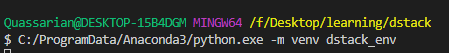
- Make your new Virtual Environment using
venvand name itdstack_env. (Chose your default python to make an environment.)
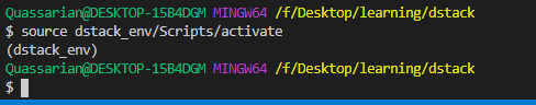
- Activate that environment.
- Install dstack on that environment.
pip install --index-url https://test.pypi.org/simple/ --upgrade --no-cache-dir --extra-index-url=https://pypi.org/simple/ dstack==0.6dev22 - Start the Server.
dstack server start - Now our link to the server is printed on a terminal and something like the below is shown.
To access the application, open this URL in the browser: http://localhost:8080/auth/verify?user=dstack&code=xxxxxxxx-xxxx-xxxx-xxxx-xxxxxxxxxxxx&next=/

The default profile in "~/.dstack/config.yaml" is already configured. You are welcome to push your data using Python or R packages.

What's next?
------------
- Checkout our documentation: https://docs.dstack.ai
- Ask questions and share feedback: https://discord.gg/8xfhEYa
- Star us on GitHub: https://github.com/dstackai/dstack
- Head over to the printed link then something like below is shown on the default browser.
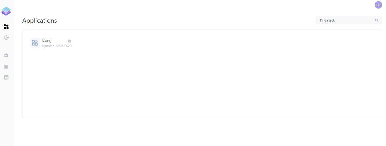
In the above example, there is already one application pushed which I did by following minimal example. But I am going to write code to Visualize the Titanic dataset with Plotly and Pandas.
For visualizing the dataset faster, I am following code from this awesome blog.
Import Dependencies
We will be using pandas for data manipulation(reading CSV and analyzing data and so on). We will be using plotly for visualizing because matplotlib’s default visualization is not okay. I tried to visualize using seaborn at first but encountered some problems. We need controls from dstack to control our tabs. To handle our app, we will be using dstack’s object itself.
import dstack.controls as ctrl
import dstack as ds
import pandas as pd
import plotly.express as px
import plotly.graph_objs as go
from plotly import figure_factory as FF
Method to Read a file
We write our first method to read files from our local storage but reading from remote is also an option.
@ds.cache()
def get_data():
    filename = "F:/Desktop/learning/dstack/blog/data/titanic_data.csv"
    return pd.read_csv(filename)
- The attribute
ds.cache()indicates that we are saving contents of this method for caching because we are considering that this method is called frequently and yes we do call it many times. - If you want to use the titanic dataset from the remote link then just change the value on the filename.
Method to Visualize Gender Vs Survival Rate
@ds.cache()
def get_gender_plot(symbols: ctrl.ComboBox):
    df = get_data()
    male_survival = df["Survived"][df["Sex"] == 'male'].value_counts(normalize = True)
    # Normalized female survival
    female_survival = df["Survived"][df["Sex"] == 'female'].value_counts(normalize = True)

    # Survival by Sex
    x0 = ['male', 'female']
    y0 = [male_survival[1], female_survival[1]]
    data = [go.Bar(
            x=x0,
            y=y0
        )]
    layout = go.Layout(autosize = False, width = 300, height = 400,
                yaxis = dict(title = 'Survival Rates'),
                title = 'Survival by Sex')
    fig1 = go.Figure(data = data, layout = layout)
    # fig1 = px.bar(x=x0, y=y0, title="Survival by Sex")
    return fig1
Few important things to notice here.
- We must add the parameter symbols and their value as
ctrl.ComboBoxbecause we might be making a dropdown menu to visualize different aspects of our plot. But not placing thatsymbols: ctrl.ComboBoxyields our app to load forever and never execute. - We called our data provider method and normalized the values of survival for each gender.
- We made an xlabel and ylabel on a seperate list then made a Bar plot using
go. - We made a Layout with different parameters like width, the height of the plot. Also, we gave a good title.
- Finally we made a figure out of those plotting data and layout then returned that figure. This figure will be pushed to our app.
Create an app For Gender Vs Survival
gender_plot = ds.app(get_gender_plot, symbols=ctrl.ComboBox(["Titanic"]))
This is a simple step, we just made an app to visualize our figure but we are not done yet. We also have to make a frame and then push this data app to our dstack server.
Create a frame
dstack uses a concept they call frame. Frame is passed onto the dstack server to build applications. It will make our dstack application available on the server and dashboard. Its name should not be containing spaces.
frame = ds.frame("titanic_data")
Add our app to dstack application
Once we made our frame or dstack application, we have to then add our plotting application or data app to dstack frame. We can also provide parameters that allows us to add tabs and from which we can navigate through different apps.
frame.add(gender_plot, params={"GenderPlot": ds.tab()})
Push our Application and Run it!
Now everything is done except we pushed our app. So after pushing it, we also want to know where our application is, and to do that we can print its URL.
result = frame.push()
print(result.url)
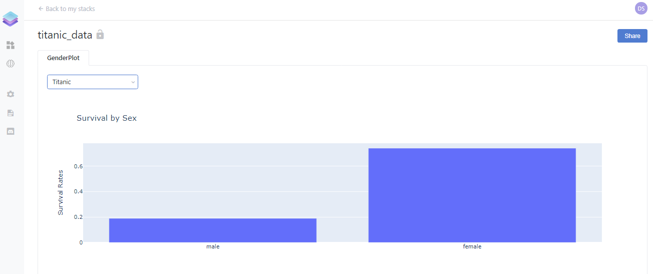
Examine it!
Now we have to run our file but make sure your dstack server is still running. If it is not then run your dstack server using dstack server start and then head over to the next terminal tab and run this python file. Now we can click on the generated URL. We should see something like below:
Add more Visualizations
Now we just made one visualization and how about making more? Now we will make a visualization for age vs survival, passenger class vs survival, and fare vs survival. I am going to share the entire code on the below block because everything is the same as the above.
import dstack.controls as ctrl
import dstack as ds
import pandas as pd
# import plotly.express as px
import plotly.graph_objs as go
# from plotly import figure_factory as FF
@ds.cache()
def get_data():
filename = "F:/Desktop/learning/dstack/blog/data/titanic_data.csv"
return pd.read_csv(filename)
@ds.cache()
def get_gender_plot(symbols: ctrl.ComboBox):
df = get_data()
male_survival = df["Survived"][df["Sex"] == 'male'].value_counts(normalize = True)
# Normalized female survival
female_survival = df["Survived"][df["Sex"] == 'female'].value_counts(normalize = True)
# Survival by Sex
x0 = ['male', 'female']
y0 = [male_survival[1], female_survival[1]]
data = [go.Bar(
x=x0,
y=y0
)]
layout = go.Layout(autosize = False, width = 300, height = 400,
yaxis = dict(title = 'Survival Rates'),
title = 'Survival by Sex')
fig1 = go.Figure(data = data, layout = layout)
# fig1 = px.bar(x=x0, y=y0, title="Survival by Sex")
return fig1
@ds.cache()
def get_age_plot(symbols: ctrl.ComboBox):
df = get_data()
#Age distribution of those who passed away
ages_deceased = df["Age"][df["Survived"] == 0]
#Age distribution of survivors
ages_survived = df["Age"][df["Survived"] == 1]
#Boxplot to show age distribution of deceased vs survived
trace_deceased = go.Box(x = ages_deceased, name = "deceased")
trace_survived = go.Box(x = ages_survived, name = "survived")
survival_by_age_data = [trace_deceased, trace_survived]
layout = go.Layout(xaxis = dict(title = 'Age'),title = "Survival by Age",
width = 600, height = 400)
fig2 = go.Figure(data=survival_by_age_data, layout=layout)
return fig2
@ds.cache()
def get_pclass_plot(symbols: ctrl.ComboBox):
df = get_data()
Pclass1 = df["Survived"][df["Pclass"] == 1].value_counts(normalize = True)
Pclass2 = df["Survived"][df["Pclass"] == 2].value_counts(normalize = True)
Pclass3 = df["Survived"][df["Pclass"] == 3].value_counts(normalize = True)
# Survival by Pclass- Barplot
x0 = ['Pclass 1', 'Pclass 2', 'Pclass 3']
y0 = [Pclass1[1], Pclass2[1], Pclass3[1]]
data = [go.Bar(
x=x0,
y=y0
)]
layout = go.Layout(autosize = False, width = 400, height = 400,
yaxis = dict(title = 'Survival Rates'),
title = 'Survival by Pclass')
fig3 = go.Figure(data = data, layout = layout)
return fig3
@ds.cache()
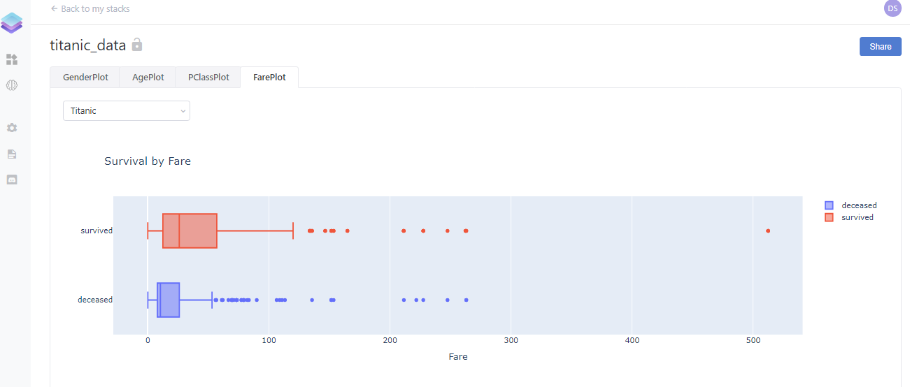
def get_fare_plot(symbols: ctrl.ComboBox):
#Fare paid by those who passed away
df= get_data()
fares_deceased = df["Fare"][df["Survived"] == 0]
#Fare paid by survivors
fares_survived = df["Fare"][df["Survived"] == 1]
#Survival by fare - Boxplot
trace0 = go.Box(x = fares_deceased, name = "deceased")
trace1 = go.Box(x = fares_survived, name = "survived")
fare_by_survival_data = [trace0, trace1]
layout = go.Layout(xaxis = dict(title = 'Fare'),title = "Survival by Fare",
width = 600, height = 400)
fig4 = go.Figure(data=fare_by_survival_data, layout=layout)
return fig4
gender_plot = ds.app(get_gender_plot, symbols=ctrl.ComboBox(["Titanic"]))
age_plot = ds.app(get_age_plot, symbols=ctrl.ComboBox(["Titanic"]))
pclass_plot = ds.app(get_pclass_plot, symbols=ctrl.ComboBox(["Titanic"]))
fare_plot = ds.app(get_fare_plot, symbols=ctrl.ComboBox(["Titanic"]))
frame = ds.frame("titanic_data")
frame.add(gender_plot, params={"GenderPlot": ds.tab()})
frame.add(age_plot, params={"AgePlot": ds.tab()})
frame.add(pclass_plot, params={"PClassPlot": ds.tab()})
frame.add(fare_plot, params={"FarePlot": ds.tab()})
result = frame.push()
print(result.url)
Finally
This is not the end of the dstack exploration because there are still many things to try out like training an ML model and pulling/pushing it from a server and deploying our dstack application on the cloud and so on. If everything went well then our final app should look like below:
If you reached this line then please leave some comments so that I can improve myself. Also if you have any queries then ping me on LinkedIn as Ramkrishna Acharya.
Why not read more?
- Gesture Based Visually Writing System Using OpenCV and Python
- Gesture Based Visually Writing System: Adding Visual User Interface
- Gesture Based Visually Writing System: Adding Virtual Animationn, New Mode and New VUI
- Gesture Based Visually Writing System: Add Slider, More Colors and Optimized OOP code
- Gesture Based Visually Writing System: A Web App
- Contour Based Game: Break The Bricks
- Linear Regression from Scratch
- Writing Popular ML Optimizers from Scratch
- Feed Forward Neural Network from Scratch
- Convolutional Neural Networks from Scratch
- Writing a Simple Image Processing Class from Scratch
- Deploying a RASA Chatbot on Android using Unity3d
- Naive Bayes for text classifications: Scratch to Framework
- Simple OCR for Devanagari Handwritten Text

Comments