
Build an Interactive Data Science Web App with Streamlit, Plotly, pandas, and scikit-learn
In the previous parts of this data science series, we explored data using descriptive and inferential statistics. We also used machine learning models to understand relationships in the data and predict possible outcomes.
Now, we will take those notebook experiments and turn them into an interactive data science web app.
We will use:
- Streamlit for the web app
- pandas for data loading and cleaning
- Plotly for interactive charts
- scikit-learn for clustering, regression, and classification
- joblib for saving and loading trained models
The goal is to build a small but useful app where we can:
- load room occupancy data
- explore datasets
- compare feature distributions
- view correlations
- run clustering
- train regression models
- train classification models
- save trained models
- load saved models
- make predictions from user input
This is a practical step because many data science projects start in notebooks, but decision-makers and users often need a simple app.
What We Are Building
We will build a Streamlit app with these modes:
| Mode | Purpose |
|---|---|
| EDA | Show raw data, distributions, box plots, and correlations |
| Clustering | Try K-Means and K-Medoids clustering |
| Regression | Predict occupancy as a continuous value using regression models |
| Classification | Predict occupancy class as vacant or occupied |
| Inference | Load a saved model and make prediction from user input |
The final app will look similar to the original screenshots.
Dataset
For this tutorial, we will use the Room Occupancy Detection Data.
The dataset is available here:
It contains three CSV-like text files:
datatraining.txtdatatest.txtdatatest2.txt
The main columns are:
| Column | Meaning |
|---|---|
date |
timestamp |
Temperature |
room temperature |
Humidity |
room humidity |
Light |
light level |
CO2 |
carbon dioxide level |
HumidityRatio |
humidity ratio |
Occupancy |
target label, 0 for vacant and 1 for occupied |
The Occupancy column is the label. It is a binary value:
0 = vacant
1 = occupied
Install Required Packages
Create a virtual environment first.
python -m venv env
source env/bin/activate
On Windows:
env\\Scripts\\activate
Install the packages:
pip install streamlit pandas numpy plotly scikit-learn joblib
If you want to use K-Medoids:
pip install scikit-learn-extra
If scikit-learn-extra gives installation issues, you can skip K-Medoids and use only K-Means.
Recommended Project Structure
A clean project structure can look like this:
streamlit-data-app/
│
├── app.py
├── models/
│   └── .gitkeep
├── data/
│   └── .gitkeep
├── requirements.txt
└── README.md
The important file is:
app.py
The models/ folder will store saved machine learning models.
Load Libraries
from pathlib import Path

import joblib
import numpy as np
import pandas as pd
import plotly.graph_objects as go
import streamlit as st

from plotly.subplots import make_subplots
from sklearn.cluster import KMeans
from sklearn.decomposition import PCA
from sklearn.ensemble import AdaBoostClassifier, RandomForestClassifier
from sklearn.linear_model import ElasticNet, Lasso, LinearRegression, LogisticRegression, Ridge
from sklearn.metrics import accuracy_score, confusion_matrix, f1_score, r2_score
from sklearn.neighbors import KNeighborsClassifier
from sklearn.pipeline import Pipeline
from sklearn.preprocessing import StandardScaler
from sklearn.tree import DecisionTreeClassifier
Optional K-Medoids import:
try:
    from sklearn_extra.cluster import KMedoids
    HAS_KMEDOIDS = True
except ImportError:
    HAS_KMEDOIDS = False
Load the Data
In older Streamlit versions, we used:
@st.cache
In newer Streamlit versions, we should use:
@st.cache_data
This is better for loading data and caching DataFrames.
@st.cache_data
def load_data():
    train = pd.read_csv(
        "https://github.com/LuisM78/Occupancy-detection-data/raw/master/datatraining.txt"
    )
    test1 = pd.read_csv(
        "https://github.com/LuisM78/Occupancy-detection-data/raw/master/datatest.txt"
    )
    test2 = pd.read_csv(
        "https://github.com/LuisM78/Occupancy-detection-data/raw/master/datatest2.txt"
    )

    for df in [train, test1, test2]:
        df["date"] = pd.to_datetime(df["date"])

    return {
        "train": train,
        "test1": test1,
        "test2": test2,
    }
Now load the data:
dfs = load_data()
Quick Data Check
Before creating the app, it is useful to understand the data.
train = dfs["train"]
test1 = dfs["test1"]
test2 = dfs["test2"]

train.head()
The data contains sensor values and the target occupancy value.
The original notebook showed the three datasets separately and checked their date ranges.
The training data covers a different date range from the two test datasets. That means we should be careful when comparing model performance.
Missing Values
The original notebook checked missing values for all three datasets.
for name, df in dfs.items():
    total = df.isnull().sum()
    percent = df.isnull().mean()

    missing = pd.concat(
        [total, percent],
        axis=1,
        keys=["Total", "Percent"]
    )

    print(name)
    print(missing)
In this dataset, there are no missing values in the main columns.
Exploratory Data Analysis
The original analysis compared each column using box plots and histograms.
Examples:
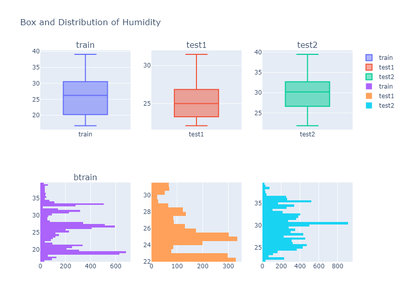
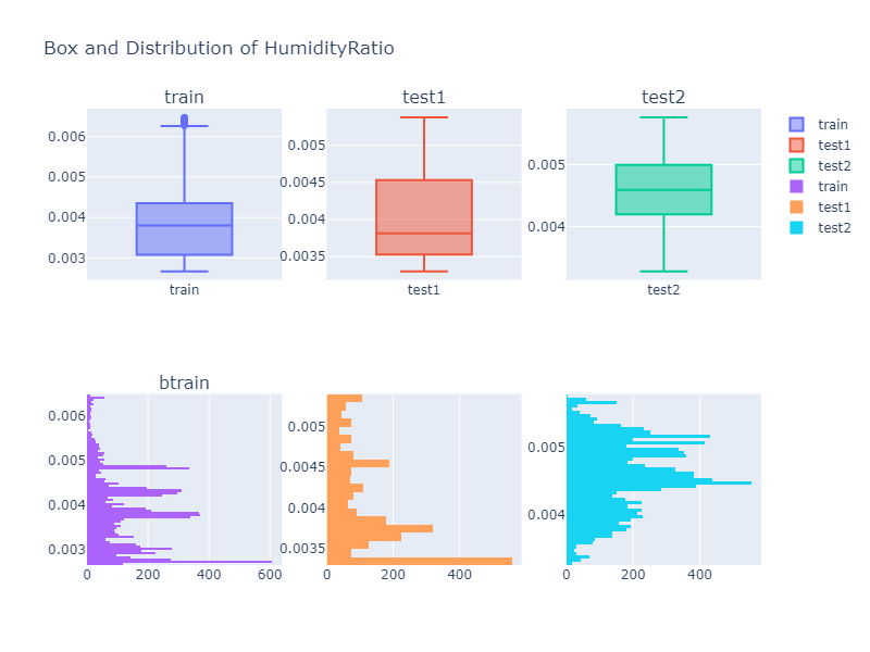
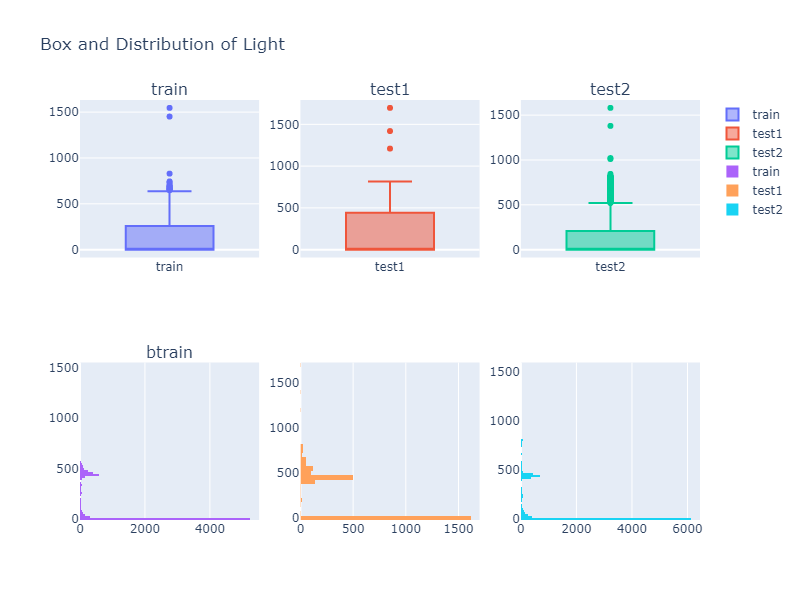
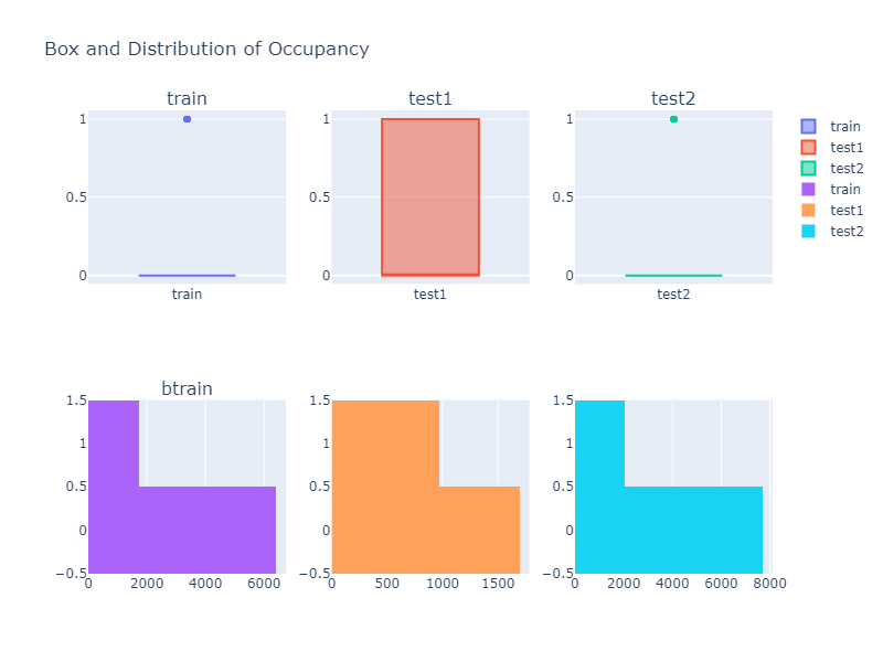
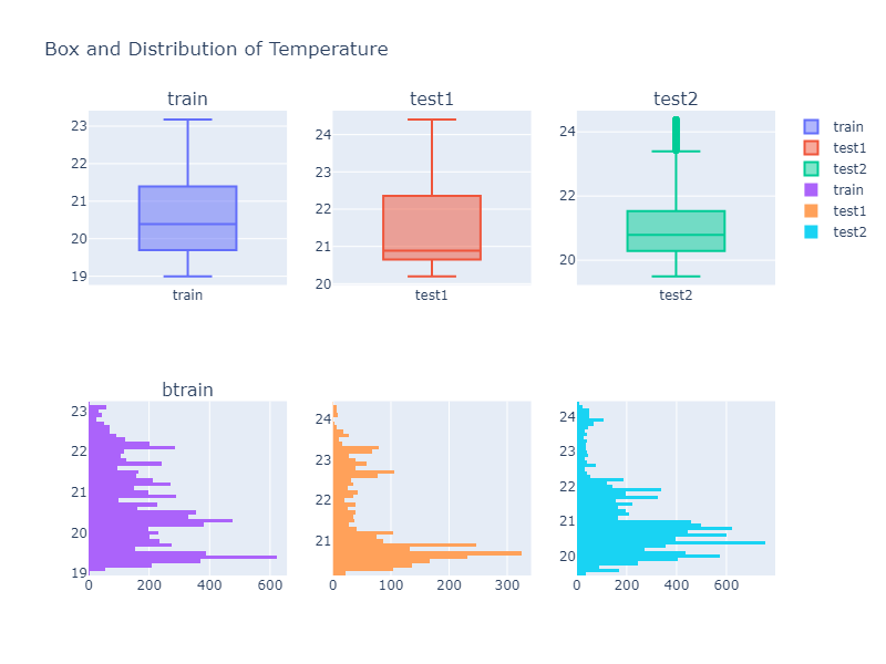
From these plots, we can see that the feature distributions are not identical across train and test data. This is important because models may perform differently when the test data distribution changes.
Correlation Analysis
Correlation helps us understand how variables move together.
The original notebook compared correlations for all three datasets.
For this app, we can generate a correlation heatmap dynamically.
def make_correlation_plot(dfs):
    titles = list(dfs.keys())

    fig = make_subplots(
        rows=1,
        cols=len(titles),
        subplot_titles=titles
    )

    for i, name in enumerate(titles, start=1):
        corr = dfs[name].select_dtypes(include="number").corr()

        fig.add_trace(
            go.Heatmap(
                z=corr.values,
                x=corr.columns,
                y=corr.index,
                coloraxis="coloraxis"
            ),
            row=1,
            col=i
        )

    fig.update_layout(
        title="Correlation Heatmaps",
        height=500,
        coloraxis={"colorscale": "Viridis"}
    )

    return fig
First Streamlit App
Now we can start building the Streamlit app.
import streamlit as st

st.set_page_config(
    page_title="Room Occupancy Data App",
    page_icon="📊",
    layout="wide"
)

st.title("Room Occupancy Data App")
st.write("Interactive EDA and machine learning app using Streamlit.")
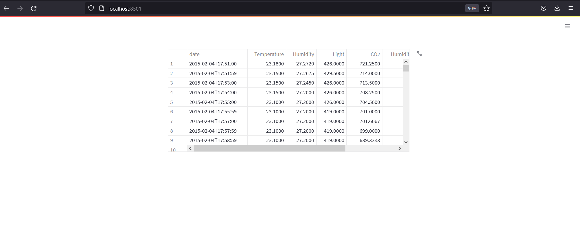
The first version only loads and displays the training data.
dfs = load_data()

st.dataframe(dfs["train"])
The app should look like this:
Run the app:
streamlit run app.py
Add Sidebar Navigation
We will use the sidebar to switch between modes.
sidebar = st.sidebar

mode = sidebar.selectbox(
    "Select a mode",
    ["EDA", "Clustering", "Regression", "Classification", "Inference"]
)

st.markdown(f"## {mode} Mode")
The original app had modes for EDA, clustering, regression, and classification. We will also add inference mode.
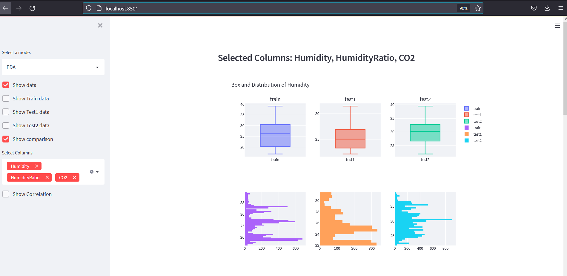
EDA Mode
EDA mode should let users:
- show raw datasets
- select columns
- compare box plots and histograms
- show correlation heatmaps
FEATURES = ["Temperature", "Humidity", "Light", "CO2", "HumidityRatio"]
TARGET = "Occupancy"
Create the EDA function:
def render_eda_mode(dfs):
    st.markdown("### Exploratory Data Analysis")

    sidebar = st.sidebar

    show_data = sidebar.checkbox("Show data")

    if show_data:
        selected_dataset = sidebar.selectbox(
            "Select dataset",
            list(dfs.keys())
        )

        st.markdown(f"#### {selected_dataset} Data")
        st.dataframe(dfs[selected_dataset])

    show_comparison = sidebar.checkbox("Show feature comparison")

    if show_comparison:
        selected_columns = sidebar.multiselect(
            "Select columns",
            FEATURES + [TARGET],
            default=["Temperature", "Humidity", "Light"]
        )

        if selected_columns:
            for column in selected_columns:
                fig = make_feature_comparison_plot(dfs, column)
                st.plotly_chart(fig, use_container_width=True)

    show_corr = sidebar.checkbox("Show correlation")

    if show_corr:
        fig = make_correlation_plot(dfs)
        st.plotly_chart(fig, use_container_width=True)
Feature comparison plot:
def make_feature_comparison_plot(dfs, column):
    titles = list(dfs.keys())

    fig = make_subplots(
        rows=2,
        cols=3,
        subplot_titles=titles,
    )

    for i, name in enumerate(titles, start=1):
        df = dfs[name]

        fig.add_trace(
            go.Box(y=df[column], name=f"{name} box"),
            row=1,
            col=i
        )

        fig.add_trace(
            go.Histogram(x=df[column], name=f"{name} hist"),
            row=2,
            col=i
        )

    fig.update_layout(
        height=650,
        title_text=f"Box Plot and Distribution of {column}",
        showlegend=False
    )

    return fig
The EDA app should look like this:
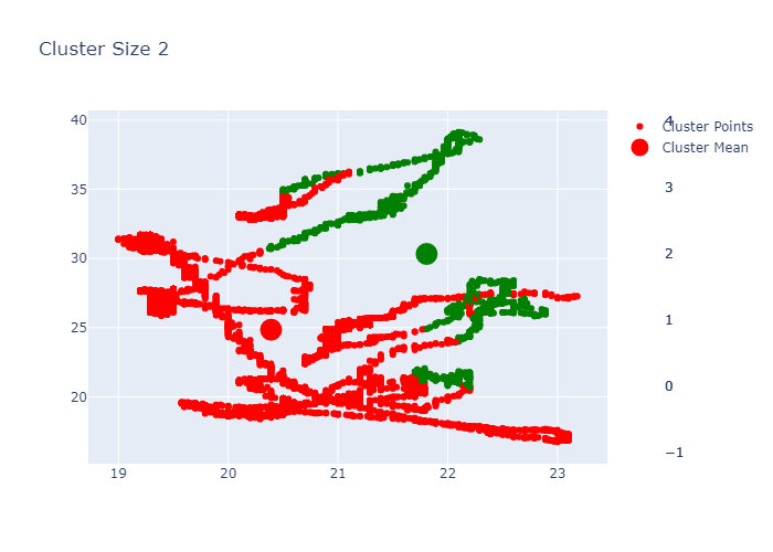
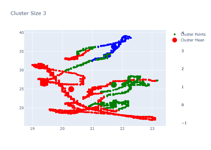
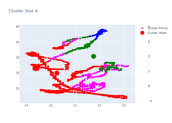
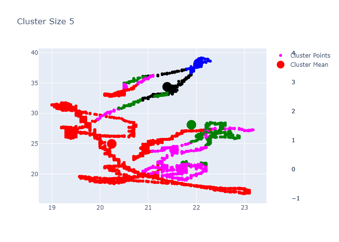
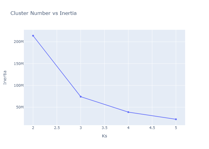
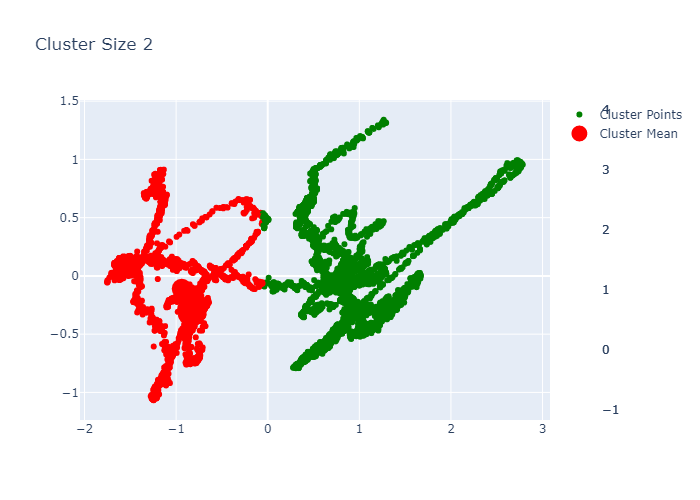
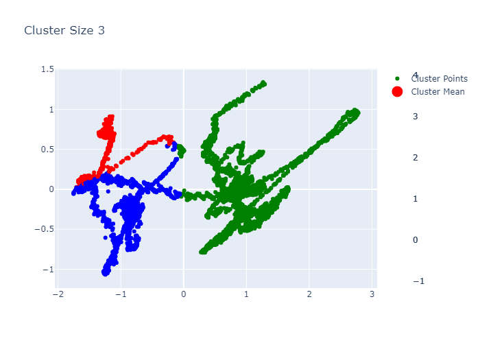
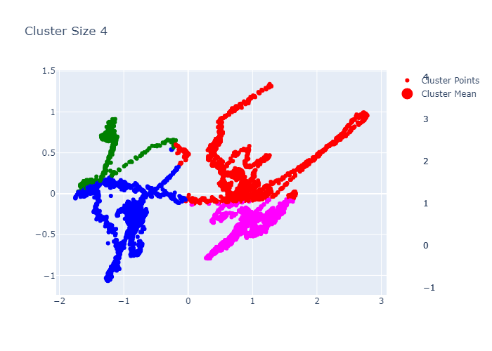
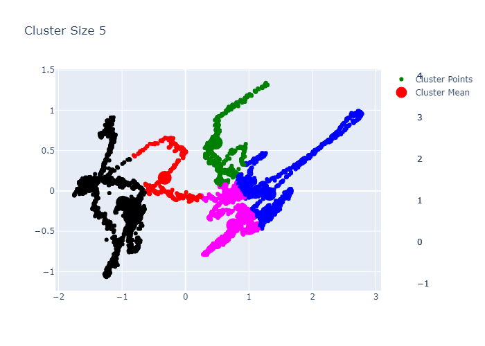
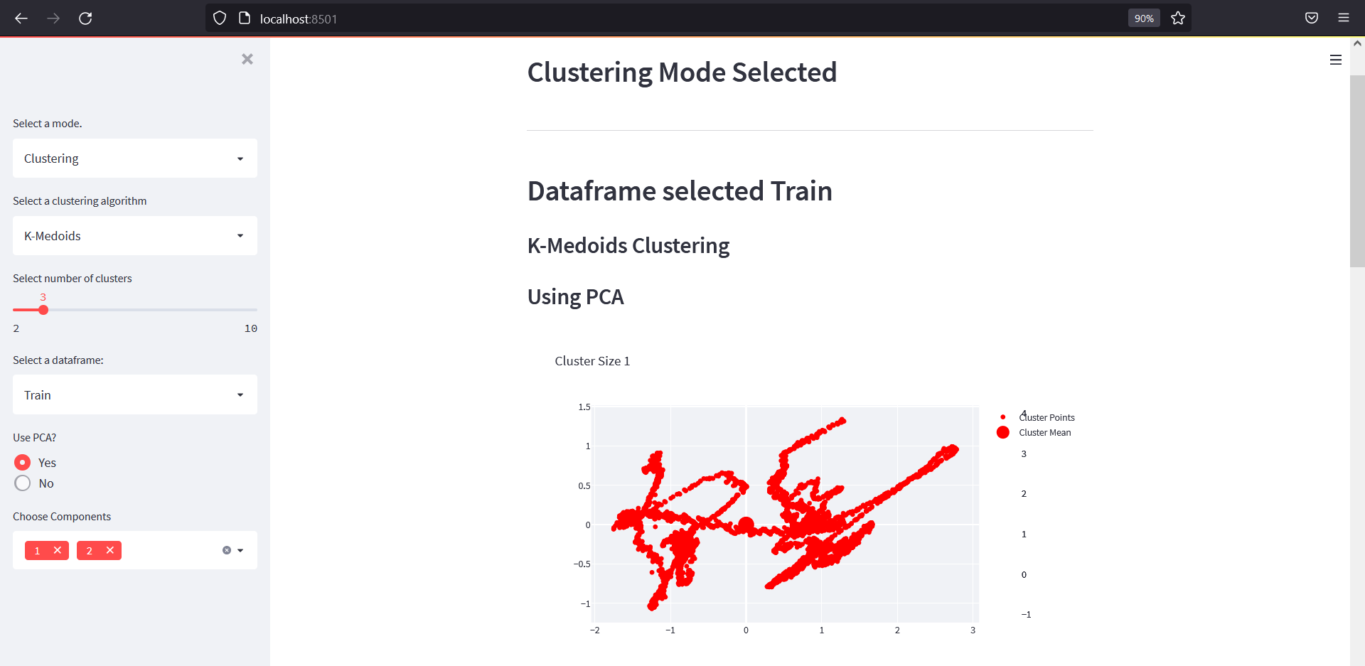
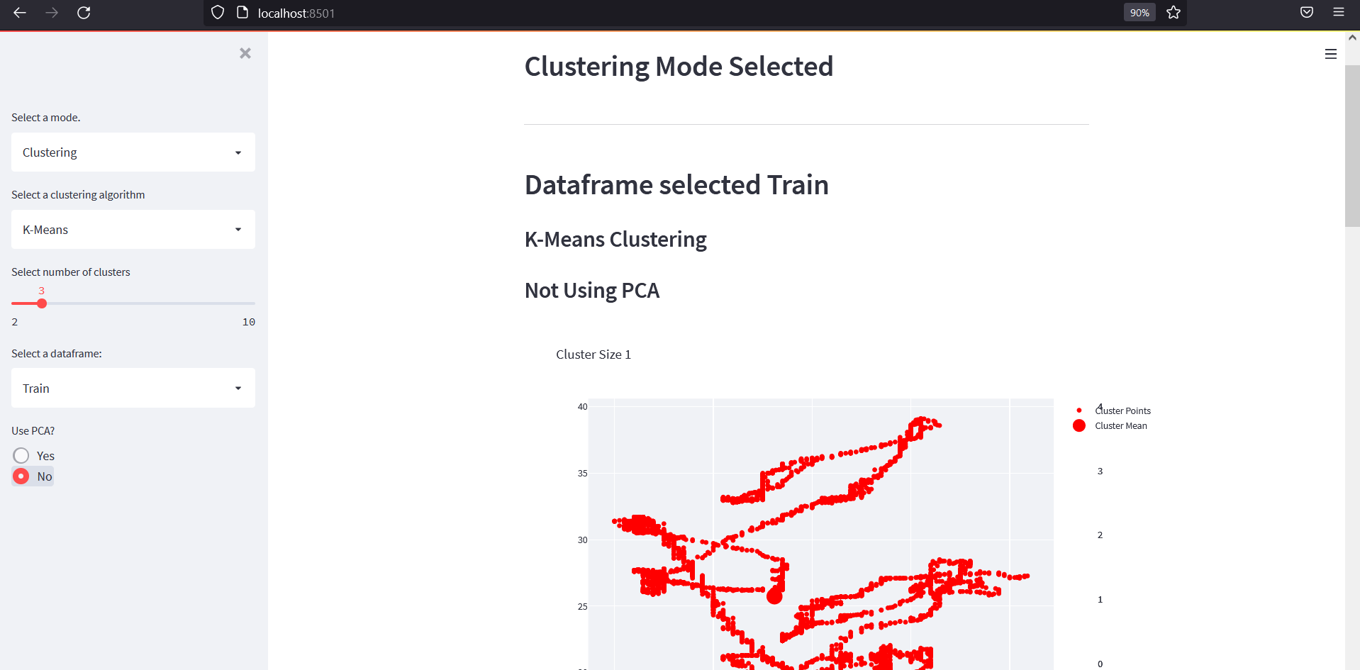
Clustering Mode
In clustering mode, we will try to group data points without using the Occupancy label.
The original notebook used:
- K-Means
- K-Medoids
- PCA for dimensionality reduction
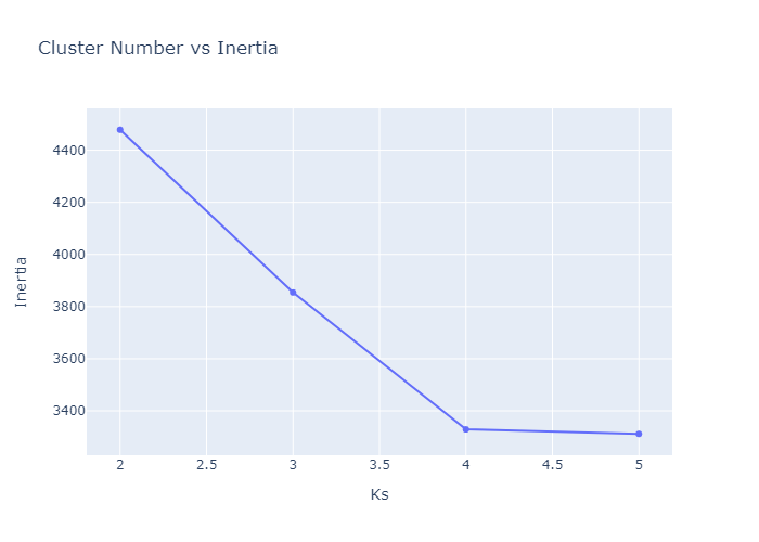
- inertia plot
Example K-Means outputs:
PCA for Dimensionality Reduction
The original notebook also used PCA to reduce the data to lower-dimensional components.
After PCA, the clusters are easier to visualize.


K-Medoids
The original version also tried K-Medoids.
Clustering Function
Here is a cleaner clustering helper.
def build_cluster_model(algorithm, n_clusters):
    if algorithm == "K-Means":
        return KMeans(n_clusters=n_clusters, random_state=42, n_init="auto")

    if algorithm == "K-Medoids":
        if not HAS_KMEDOIDS:
            raise ImportError("Install scikit-learn-extra to use K-Medoids.")

        return KMedoids(n_clusters=n_clusters, random_state=42)

    raise ValueError(f"Unknown clustering algorithm: {algorithm}")
Render clustering mode:
def render_clustering_mode(dfs):
    st.markdown("### Clustering")

    sidebar = st.sidebar

    algorithms = ["K-Means"]

    if HAS_KMEDOIDS:
        algorithms.append("K-Medoids")

    algorithm = sidebar.selectbox(
        "Select clustering algorithm",
        algorithms
    )

    selected_dataset = sidebar.selectbox(
        "Select dataset",
        list(dfs.keys())
    )

    selected_features = sidebar.multiselect(
        "Select features",
        FEATURES,
        default=["Temperature", "Humidity", "CO2"]
    )

    n_clusters = sidebar.slider(
        "Number of clusters",
        min_value=2,
        max_value=10,
        value=2
    )

    use_pca = sidebar.checkbox("Use PCA", value=True)

    if len(selected_features) < 2:
        st.warning("Please select at least two features.")
        return

    df = dfs[selected_dataset].copy()

    X = df[selected_features]

    scaler = StandardScaler()
    X_scaled = scaler.fit_transform(X)

    if use_pca:
        pca = PCA(n_components=2)
        X_plot = pca.fit_transform(X_scaled)
        x_label = "PCA 1"
        y_label = "PCA 2"
    else:
        X_plot = X_scaled[:, :2]
        x_label = selected_features[0]
        y_label = selected_features[1]

    model = build_cluster_model(algorithm, n_clusters)
    clusters = model.fit_predict(X_plot)

    plot_df = pd.DataFrame({
        "x": X_plot[:, 0],
        "y": X_plot[:, 1],
        "cluster": clusters.astype(str),
        "Occupancy": df[TARGET].astype(str),
    })

    fig = go.Figure()

    for cluster_id in sorted(plot_df["cluster"].unique()):
        cdf = plot_df[plot_df["cluster"] == cluster_id]

        fig.add_trace(
            go.Scatter(
                x=cdf["x"],
                y=cdf["y"],
                mode="markers",
                name=f"Cluster {cluster_id}",
                marker={"size": 5}
            )
        )

    fig.update_layout(
        title=f"{algorithm} Clustering",
        xaxis_title=x_label,
        yaxis_title=y_label,
        height=600
    )

    st.plotly_chart(fig, use_container_width=True)
The clustering app should look like this:
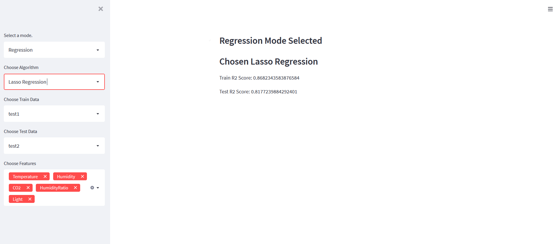
Regression Mode
The original app added regression models to predict Occupancy.
Technically, Occupancy is a binary label, so classification is the more correct machine learning task. But regression can still be useful for learning how model training, feature selection, and scoring work inside Streamlit.
The original models were:
- Linear Regression
- Ridge Regression
- Lasso Regression
- Elastic Net
Example output:
Then coefficients and prediction input were added:
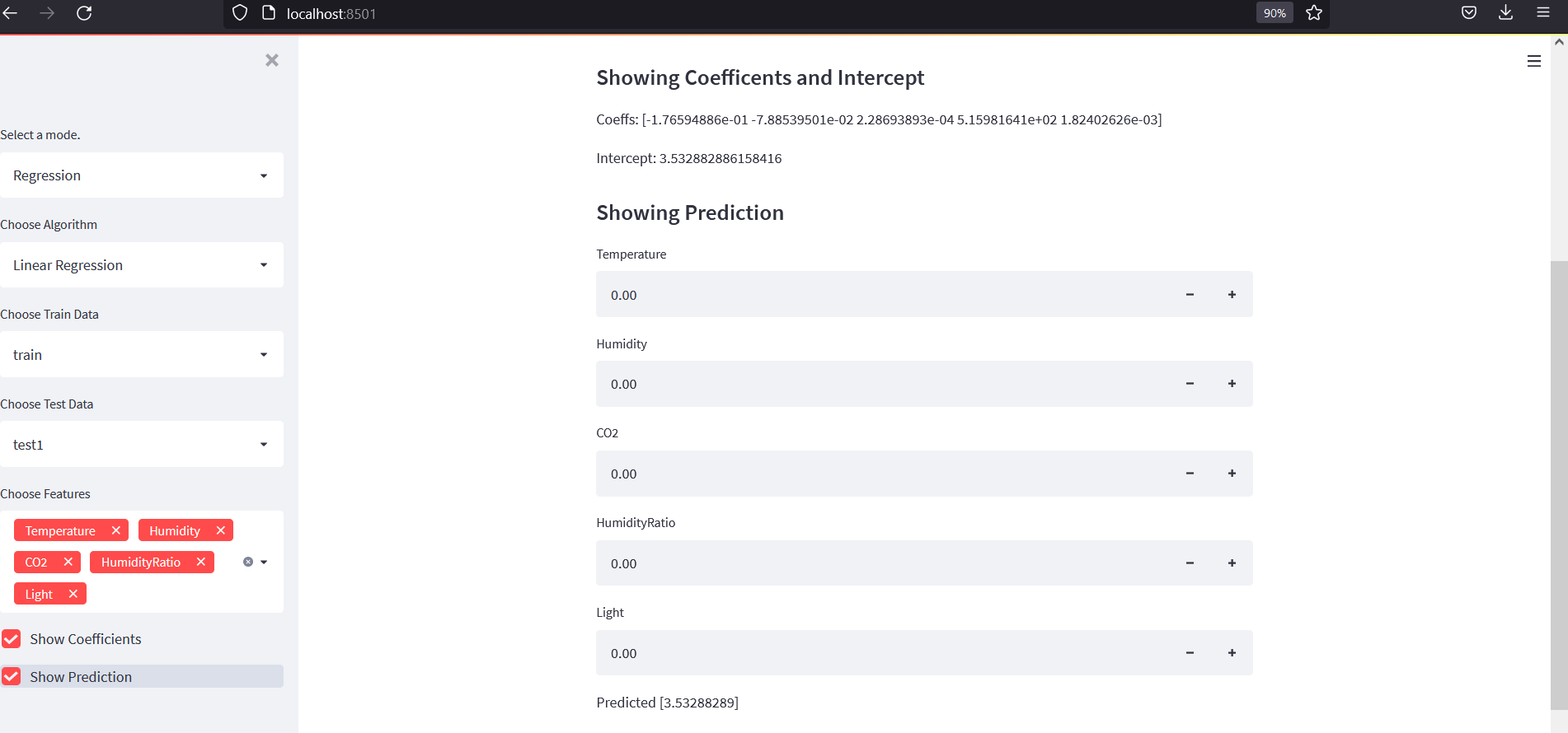
Regression Model Function
def build_regression_model(name):
    models = {
        "Linear Regression": LinearRegression(),
        "Ridge Regression": Ridge(),
        "Lasso Regression": Lasso(),
        "Elastic Net": ElasticNet(),
    }

    return models[name]
Render regression mode:
def render_regression_mode(dfs):
    st.markdown("### Regression")

    sidebar = st.sidebar

    algorithm = sidebar.selectbox(
        "Choose algorithm",
        ["Linear Regression", "Ridge Regression", "Lasso Regression", "Elastic Net"]
    )

    train_name = sidebar.selectbox("Choose train data", list(dfs.keys()))
    test_name = sidebar.selectbox(
        "Choose test data",
        [name for name in dfs.keys() if name != train_name]
    )

    selected_features = sidebar.multiselect(
        "Choose features",
        FEATURES,
        default=FEATURES
    )

    if not selected_features:
        st.warning("Please select at least one feature.")
        return

    train_df = dfs[train_name]
    test_df = dfs[test_name]

    x_train = train_df[selected_features]
    y_train = train_df[TARGET]

    x_test = test_df[selected_features]
    y_test = test_df[TARGET]

    model = Pipeline([
        ("scaler", StandardScaler()),
        ("model", build_regression_model(algorithm)),
    ])

    model.fit(x_train, y_train)

    train_pred = model.predict(x_train)
    test_pred = model.predict(x_test)

    st.markdown(f"#### Chosen algorithm: `{algorithm}`")
    st.metric("Train R2 Score", f"{r2_score(y_train, train_pred):.3f}")
    st.metric("Test R2 Score", f"{r2_score(y_test, test_pred):.3f}")

    if sidebar.checkbox("Show prediction form"):
        render_prediction_form(model, selected_features, task="regression")

    if sidebar.checkbox("Save model"):
        save_model_form(model, selected_features, task="regression")
Classification Mode
For this dataset, classification is more appropriate because the target column is binary.
The original app used:
- Logistic Regression
- KNN
- Decision Tree
- Random Forest
- AdaBoost
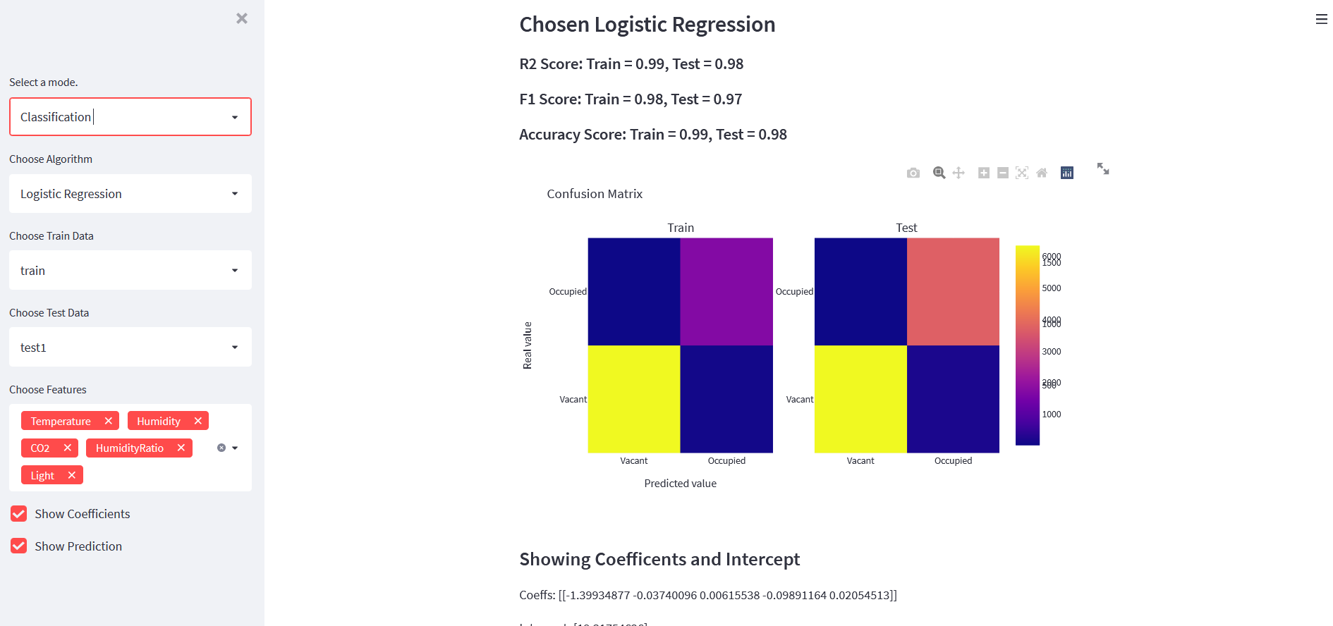
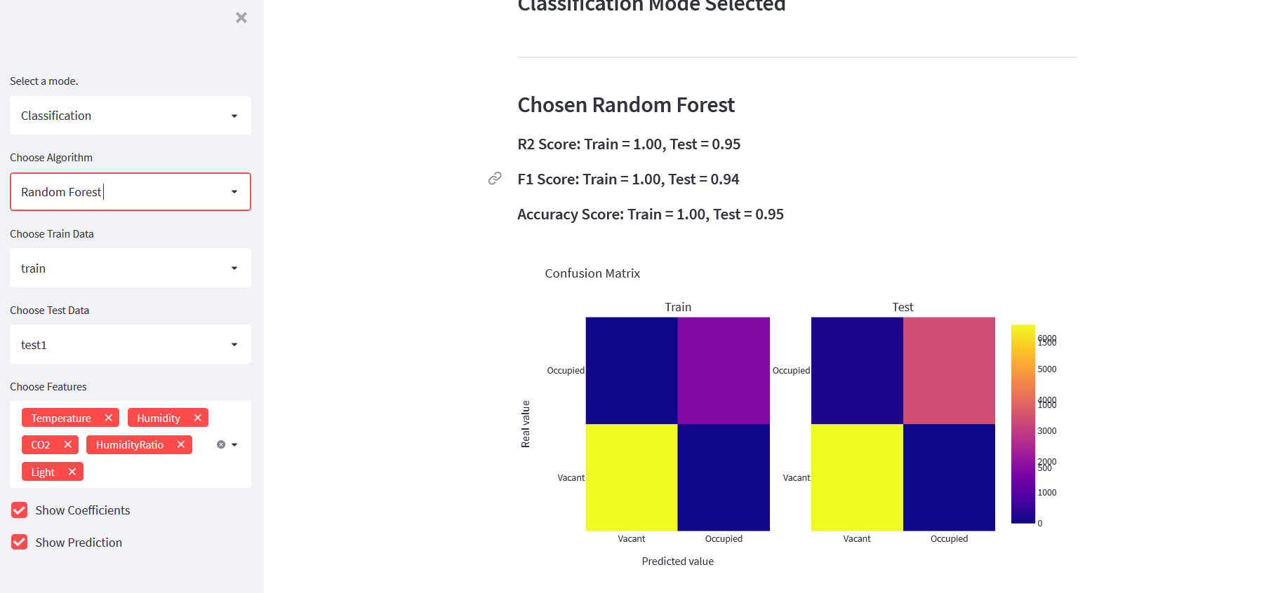
It also displayed:
- train score
- test score
- F1 score
- accuracy score
- confusion matrix
- prediction form
Example app screenshots:
Classification Model Function
def build_classification_model(name):
    models = {
        "Logistic Regression": LogisticRegression(max_iter=1000),
        "KNN": KNeighborsClassifier(),
        "Decision Tree": DecisionTreeClassifier(random_state=42),
        "Random Forest": RandomForestClassifier(random_state=42),
        "AdaBoost": AdaBoostClassifier(random_state=42),
    }

    return models[name]
Render classification mode:
def render_classification_mode(dfs):
    st.markdown("### Classification")

    sidebar = st.sidebar

    algorithm = sidebar.selectbox(
        "Choose algorithm",
        ["Logistic Regression", "KNN", "Decision Tree", "Random Forest", "AdaBoost"]
    )

    train_name = sidebar.selectbox("Choose train data", list(dfs.keys()))
    test_name = sidebar.selectbox(
        "Choose test data",
        [name for name in dfs.keys() if name != train_name]
    )

    selected_features = sidebar.multiselect(
        "Choose features",
        FEATURES,
        default=FEATURES
    )

    if not selected_features:
        st.warning("Please select at least one feature.")
        return

    train_df = dfs[train_name]
    test_df = dfs[test_name]

    x_train = train_df[selected_features]
    y_train = train_df[TARGET]

    x_test = test_df[selected_features]
    y_test = test_df[TARGET]

    model = Pipeline([
        ("scaler", StandardScaler()),
        ("model", build_classification_model(algorithm)),
    ])

    model.fit(x_train, y_train)

    train_pred = model.predict(x_train)
    test_pred = model.predict(x_test)

    train_acc = accuracy_score(y_train, train_pred)
    test_acc = accuracy_score(y_test, test_pred)

    train_f1 = f1_score(y_train, train_pred, average="macro")
    test_f1 = f1_score(y_test, test_pred, average="macro")

    st.markdown(f"#### Chosen algorithm: `{algorithm}`")

    c1, c2, c3, c4 = st.columns(4)

    c1.metric("Train Accuracy", f"{train_acc:.3f}")
    c2.metric("Test Accuracy", f"{test_acc:.3f}")
    c3.metric("Train F1", f"{train_f1:.3f}")
    c4.metric("Test F1", f"{test_f1:.3f}")

    fig = make_confusion_matrix_plot(y_train, train_pred, y_test, test_pred)
    st.plotly_chart(fig, use_container_width=True)

    if sidebar.checkbox("Show prediction form"):
        render_prediction_form(model, selected_features, task="classification")

    if sidebar.checkbox("Save model"):
        save_model_form(model, selected_features, task="classification")
Confusion Matrix Plot
def make_confusion_matrix_plot(y_train, train_pred, y_test, test_pred):
    labels = ["Vacant", "Occupied"]

    cm_train = confusion_matrix(y_train, train_pred, labels=[0, 1])
    cm_test = confusion_matrix(y_test, test_pred, labels=[0, 1])

    fig = make_subplots(
        rows=1,
        cols=2,
        subplot_titles=["Train", "Test"]
    )

    fig.add_trace(
        go.Heatmap(
            z=cm_train,
            x=labels,
            y=labels,
            colorscale="Blues",
            showscale=False,
            text=cm_train,
            texttemplate="%{text}"
        ),
        row=1,
        col=1
    )

    fig.add_trace(
        go.Heatmap(
            z=cm_test,
            x=labels,
            y=labels,
            colorscale="Blues",
            showscale=False,
            text=cm_test,
            texttemplate="%{text}"
        ),
        row=1,
        col=2
    )

    fig.update_layout(
        title="Confusion Matrix",
        height=500
    )

    fig.update_xaxes(title_text="Predicted")
    fig.update_yaxes(title_text="Actual")

    return fig
Prediction Form
We can let users enter feature values manually.
def render_prediction_form(model, selected_features, task):
    st.markdown("#### Prediction Form")

    input_values = []

    with st.form(f"{task}_prediction_form"):
        for feature in selected_features:
            value = st.number_input(
                feature,
                value=0.0,
                step=0.1
            )
            input_values.append(value)

        submitted = st.form_submit_button("Predict")

    if submitted:
        prediction = model.predict([input_values])

        st.write("Input values:", input_values)
        st.write("Prediction:", prediction[0])

        if task == "classification":
            label = "Occupied" if int(prediction[0]) == 1 else "Vacant"
            st.success(f"Predicted class: {label}")
Save Trained Models
The original article later added saved models and inference mode. This is useful because we do not always want to train the model again before making predictions.
We can use joblib.
MODEL_DIR = Path("models")
MODEL_DIR.mkdir(exist_ok=True)
Save model with metadata:
def save_model_form(model, selected_features, task):
    model_name = st.text_input(
        "Model file name",
        value=f"{task}_model.joblib"
    )

    if st.button("Save model"):
        if not model_name.endswith(".joblib"):
            model_name += ".joblib"

        payload = {
            "model": model,
            "features": selected_features,
            "task": task,
        }

        file_path = MODEL_DIR / model_name

        joblib.dump(payload, file_path)

        st.success(f"Model saved to `{file_path}`")
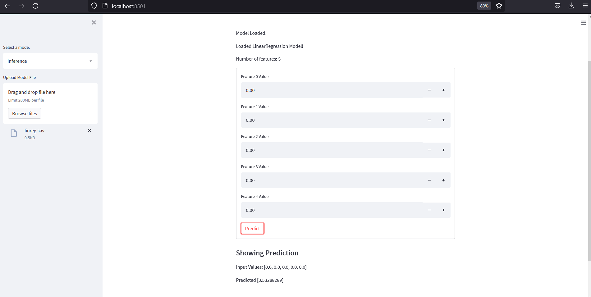
Inference Mode
Inference mode loads a saved model and lets users make predictions.
The original final app showed inference input and prediction output.
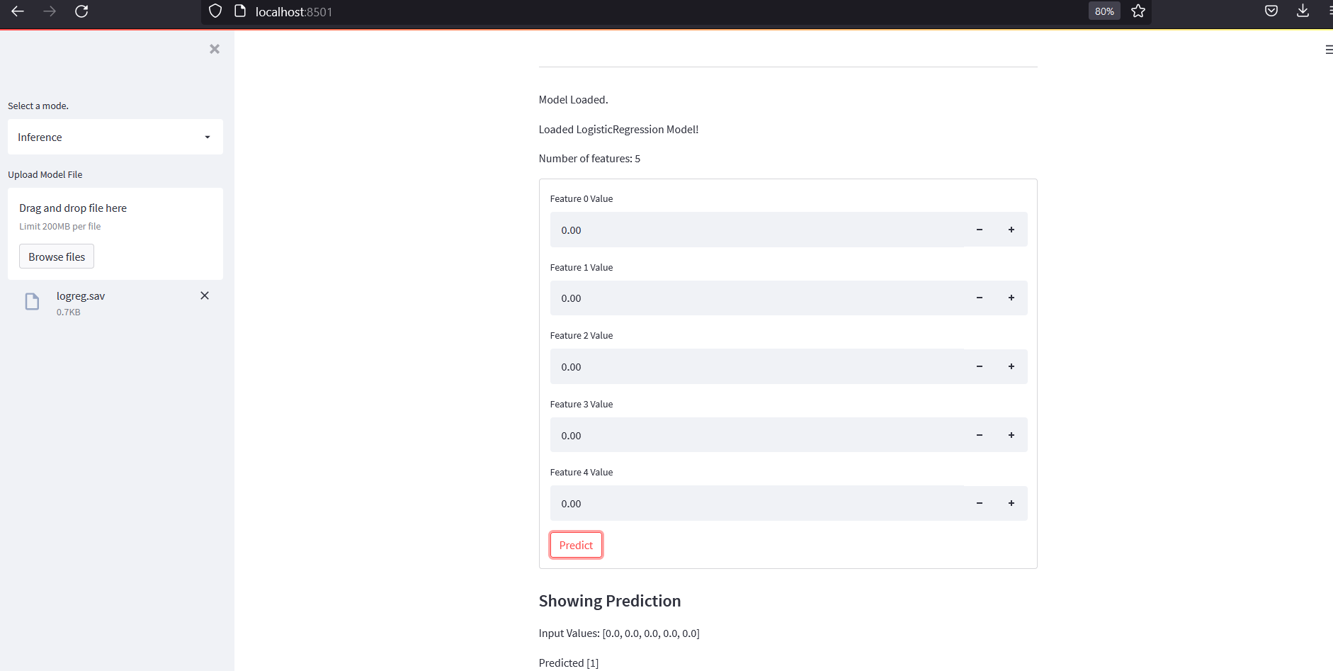
Here is a cleaner implementation.
def render_inference_mode():
    st.markdown("### Inference Mode")

    model_files = sorted(MODEL_DIR.glob("*.joblib"))

    if not model_files:
        st.warning("No saved models found. Train and save a model first.")
        return

    selected_model_file = st.selectbox(
        "Choose saved model",
        model_files,
        format_func=lambda path: path.name
    )

    payload = joblib.load(selected_model_file)

    model = payload["model"]
    features = payload["features"]
    task = payload["task"]

    st.write("Task:", task)
    st.write("Features:", features)

    render_prediction_form(model, features, task)
Full Modern app.py
Below is a compact full version of the updated app.
from pathlib import Path

import joblib
import numpy as np
import pandas as pd
import plotly.graph_objects as go
import streamlit as st

from plotly.subplots import make_subplots
from sklearn.cluster import KMeans
from sklearn.decomposition import PCA
from sklearn.ensemble import AdaBoostClassifier, RandomForestClassifier
from sklearn.linear_model import ElasticNet, Lasso, LinearRegression, LogisticRegression, Ridge
from sklearn.metrics import accuracy_score, confusion_matrix, f1_score, r2_score
from sklearn.neighbors import KNeighborsClassifier
from sklearn.pipeline import Pipeline
from sklearn.preprocessing import StandardScaler
from sklearn.tree import DecisionTreeClassifier


try:
    from sklearn_extra.cluster import KMedoids
    HAS_KMEDOIDS = True
except ImportError:
    HAS_KMEDOIDS = False


FEATURES = ["Temperature", "Humidity", "Light", "CO2", "HumidityRatio"]
TARGET = "Occupancy"

MODEL_DIR = Path("models")
MODEL_DIR.mkdir(exist_ok=True)


@st.cache_data
def load_data():
    train = pd.read_csv(
        "https://github.com/LuisM78/Occupancy-detection-data/raw/master/datatraining.txt"
    )
    test1 = pd.read_csv(
        "https://github.com/LuisM78/Occupancy-detection-data/raw/master/datatest.txt"
    )
    test2 = pd.read_csv(
        "https://github.com/LuisM78/Occupancy-detection-data/raw/master/datatest2.txt"
    )

    for df in [train, test1, test2]:
        df["date"] = pd.to_datetime(df["date"])

    return {
        "train": train,
        "test1": test1,
        "test2": test2,
    }


def make_feature_comparison_plot(dfs, column):
    titles = list(dfs.keys())

    fig = make_subplots(
        rows=2,
        cols=3,
        subplot_titles=titles,
    )

    for i, name in enumerate(titles, start=1):
        df = dfs[name]

        fig.add_trace(
            go.Box(y=df[column], name=f"{name} box"),
            row=1,
            col=i
        )

        fig.add_trace(
            go.Histogram(x=df[column], name=f"{name} hist"),
            row=2,
            col=i
        )

    fig.update_layout(
        height=650,
        title_text=f"Box Plot and Distribution of {column}",
        showlegend=False
    )

    return fig


def make_correlation_plot(dfs):
    titles = list(dfs.keys())

    fig = make_subplots(
        rows=1,
        cols=len(titles),
        subplot_titles=titles
    )

    for i, name in enumerate(titles, start=1):
        corr = dfs[name].select_dtypes(include="number").corr()

        fig.add_trace(
            go.Heatmap(
                z=corr.values,
                x=corr.columns,
                y=corr.index,
                coloraxis="coloraxis"
            ),
            row=1,
            col=i
        )

    fig.update_layout(
        title="Correlation Heatmaps",
        height=500,
        coloraxis={"colorscale": "Viridis"}
    )

    return fig


def render_eda_mode(dfs):
    st.markdown("### Exploratory Data Analysis")

    sidebar = st.sidebar

    show_data = sidebar.checkbox("Show data")

    if show_data:
        selected_dataset = sidebar.selectbox(
            "Select dataset",
            list(dfs.keys())
        )

        st.markdown(f"#### {selected_dataset} Data")
        st.dataframe(dfs[selected_dataset])

    show_comparison = sidebar.checkbox("Show feature comparison")

    if show_comparison:
        selected_columns = sidebar.multiselect(
            "Select columns",
            FEATURES + [TARGET],
            default=["Temperature", "Humidity", "Light"]
        )

        if selected_columns:
            for column in selected_columns:
                fig = make_feature_comparison_plot(dfs, column)
                st.plotly_chart(fig, use_container_width=True)

    show_corr = sidebar.checkbox("Show correlation")

    if show_corr:
        fig = make_correlation_plot(dfs)
        st.plotly_chart(fig, use_container_width=True)


def build_cluster_model(algorithm, n_clusters):
    if algorithm == "K-Means":
        return KMeans(n_clusters=n_clusters, random_state=42, n_init="auto")

    if algorithm == "K-Medoids":
        if not HAS_KMEDOIDS:
            raise ImportError("Install scikit-learn-extra to use K-Medoids.")

        return KMedoids(n_clusters=n_clusters, random_state=42)

    raise ValueError(f"Unknown clustering algorithm: {algorithm}")


def render_clustering_mode(dfs):
    st.markdown("### Clustering")

    sidebar = st.sidebar

    algorithms = ["K-Means"]

    if HAS_KMEDOIDS:
        algorithms.append("K-Medoids")

    algorithm = sidebar.selectbox(
        "Select clustering algorithm",
        algorithms
    )

    selected_dataset = sidebar.selectbox(
        "Select dataset",
        list(dfs.keys())
    )

    selected_features = sidebar.multiselect(
        "Select features",
        FEATURES,
        default=["Temperature", "Humidity", "CO2"]
    )

    n_clusters = sidebar.slider(
        "Number of clusters",
        min_value=2,
        max_value=10,
        value=2
    )

    use_pca = sidebar.checkbox("Use PCA", value=True)

    if len(selected_features) < 2:
        st.warning("Please select at least two features.")
        return

    df = dfs[selected_dataset].copy()

    X = df[selected_features]

    scaler = StandardScaler()
    X_scaled = scaler.fit_transform(X)

    if use_pca:
        pca = PCA(n_components=2)
        X_plot = pca.fit_transform(X_scaled)
        x_label = "PCA 1"
        y_label = "PCA 2"
    else:
        X_plot = X_scaled[:, :2]
        x_label = selected_features[0]
        y_label = selected_features[1]

    model = build_cluster_model(algorithm, n_clusters)
    clusters = model.fit_predict(X_plot)

    plot_df = pd.DataFrame({
        "x": X_plot[:, 0],
        "y": X_plot[:, 1],
        "cluster": clusters.astype(str),
        "Occupancy": df[TARGET].astype(str),
    })

    fig = go.Figure()

    for cluster_id in sorted(plot_df["cluster"].unique()):
        cdf = plot_df[plot_df["cluster"] == cluster_id]

        fig.add_trace(
            go.Scatter(
                x=cdf["x"],
                y=cdf["y"],
                mode="markers",
                name=f"Cluster {cluster_id}",
                marker={"size": 5}
            )
        )

    fig.update_layout(
        title=f"{algorithm} Clustering",
        xaxis_title=x_label,
        yaxis_title=y_label,
        height=600
    )

    st.plotly_chart(fig, use_container_width=True)


def build_regression_model(name):
    models = {
        "Linear Regression": LinearRegression(),
        "Ridge Regression": Ridge(),
        "Lasso Regression": Lasso(),
        "Elastic Net": ElasticNet(),
    }

    return models[name]


def build_classification_model(name):
    models = {
        "Logistic Regression": LogisticRegression(max_iter=1000),
        "KNN": KNeighborsClassifier(),
        "Decision Tree": DecisionTreeClassifier(random_state=42),
        "Random Forest": RandomForestClassifier(random_state=42),
        "AdaBoost": AdaBoostClassifier(random_state=42),
    }

    return models[name]


def render_prediction_form(model, selected_features, task):
    st.markdown("#### Prediction Form")

    input_values = []

    with st.form(f"{task}_prediction_form"):
        for feature in selected_features:
            value = st.number_input(
                feature,
                value=0.0,
                step=0.1
            )
            input_values.append(value)

        submitted = st.form_submit_button("Predict")

    if submitted:
        prediction = model.predict([input_values])

        st.write("Input values:", input_values)
        st.write("Prediction:", prediction[0])

        if task == "classification":
            label = "Occupied" if int(prediction[0]) == 1 else "Vacant"
            st.success(f"Predicted class: {label}")


def save_model_form(model, selected_features, task):
    model_name = st.text_input(
        "Model file name",
        value=f"{task}_model.joblib"
    )

    if st.button("Save model"):
        if not model_name.endswith(".joblib"):
            model_name += ".joblib"

        payload = {
            "model": model,
            "features": selected_features,
            "task": task,
        }

        file_path = MODEL_DIR / model_name

        joblib.dump(payload, file_path)

        st.success(f"Model saved to `{file_path}`")


def render_regression_mode(dfs):
    st.markdown("### Regression")

    sidebar = st.sidebar

    algorithm = sidebar.selectbox(
        "Choose algorithm",
        ["Linear Regression", "Ridge Regression", "Lasso Regression", "Elastic Net"]
    )

    train_name = sidebar.selectbox("Choose train data", list(dfs.keys()))
    test_name = sidebar.selectbox(
        "Choose test data",
        [name for name in dfs.keys() if name != train_name]
    )

    selected_features = sidebar.multiselect(
        "Choose features",
        FEATURES,
        default=FEATURES
    )

    if not selected_features:
        st.warning("Please select at least one feature.")
        return

    train_df = dfs[train_name]
    test_df = dfs[test_name]

    x_train = train_df[selected_features]
    y_train = train_df[TARGET]

    x_test = test_df[selected_features]
    y_test = test_df[TARGET]

    model = Pipeline([
        ("scaler", StandardScaler()),
        ("model", build_regression_model(algorithm)),
    ])

    model.fit(x_train, y_train)

    train_pred = model.predict(x_train)
    test_pred = model.predict(x_test)

    st.markdown(f"#### Chosen algorithm: `{algorithm}`")
    st.metric("Train R2 Score", f"{r2_score(y_train, train_pred):.3f}")
    st.metric("Test R2 Score", f"{r2_score(y_test, test_pred):.3f}")

    if sidebar.checkbox("Show prediction form"):
        render_prediction_form(model, selected_features, task="regression")

    if sidebar.checkbox("Save model"):
        save_model_form(model, selected_features, task="regression")


def make_confusion_matrix_plot(y_train, train_pred, y_test, test_pred):
    labels = ["Vacant", "Occupied"]

    cm_train = confusion_matrix(y_train, train_pred, labels=[0, 1])
    cm_test = confusion_matrix(y_test, test_pred, labels=[0, 1])

    fig = make_subplots(
        rows=1,
        cols=2,
        subplot_titles=["Train", "Test"]
    )

    fig.add_trace(
        go.Heatmap(
            z=cm_train,
            x=labels,
            y=labels,
            colorscale="Blues",
            showscale=False,
            text=cm_train,
            texttemplate="%{text}"
        ),
        row=1,
        col=1
    )

    fig.add_trace(
        go.Heatmap(
            z=cm_test,
            x=labels,
            y=labels,
            colorscale="Blues",
            showscale=False,
            text=cm_test,
            texttemplate="%{text}"
        ),
        row=1,
        col=2
    )

    fig.update_layout(
        title="Confusion Matrix",
        height=500
    )

    fig.update_xaxes(title_text="Predicted")
    fig.update_yaxes(title_text="Actual")

    return fig


def render_classification_mode(dfs):
    st.markdown("### Classification")

    sidebar = st.sidebar

    algorithm = sidebar.selectbox(
        "Choose algorithm",
        ["Logistic Regression", "KNN", "Decision Tree", "Random Forest", "AdaBoost"]
    )

    train_name = sidebar.selectbox("Choose train data", list(dfs.keys()))
    test_name = sidebar.selectbox(
        "Choose test data",
        [name for name in dfs.keys() if name != train_name]
    )

    selected_features = sidebar.multiselect(
        "Choose features",
        FEATURES,
        default=FEATURES
    )

    if not selected_features:
        st.warning("Please select at least one feature.")
        return

    train_df = dfs[train_name]
    test_df = dfs[test_name]

    x_train = train_df[selected_features]
    y_train = train_df[TARGET]

    x_test = test_df[selected_features]
    y_test = test_df[TARGET]

    model = Pipeline([
        ("scaler", StandardScaler()),
        ("model", build_classification_model(algorithm)),
    ])

    model.fit(x_train, y_train)

    train_pred = model.predict(x_train)
    test_pred = model.predict(x_test)

    train_acc = accuracy_score(y_train, train_pred)
    test_acc = accuracy_score(y_test, test_pred)

    train_f1 = f1_score(y_train, train_pred, average="macro")
    test_f1 = f1_score(y_test, test_pred, average="macro")

    st.markdown(f"#### Chosen algorithm: `{algorithm}`")

    c1, c2, c3, c4 = st.columns(4)

    c1.metric("Train Accuracy", f"{train_acc:.3f}")
    c2.metric("Test Accuracy", f"{test_acc:.3f}")
    c3.metric("Train F1", f"{train_f1:.3f}")
    c4.metric("Test F1", f"{test_f1:.3f}")

    fig = make_confusion_matrix_plot(y_train, train_pred, y_test, test_pred)
    st.plotly_chart(fig, use_container_width=True)

    if sidebar.checkbox("Show prediction form"):
        render_prediction_form(model, selected_features, task="classification")

    if sidebar.checkbox("Save model"):
        save_model_form(model, selected_features, task="classification")


def render_inference_mode():
    st.markdown("### Inference Mode")

    model_files = sorted(MODEL_DIR.glob("*.joblib"))

    if not model_files:
        st.warning("No saved models found. Train and save a model first.")
        return

    selected_model_file = st.selectbox(
        "Choose saved model",
        model_files,
        format_func=lambda path: path.name
    )

    payload = joblib.load(selected_model_file)

    model = payload["model"]
    features = payload["features"]
    task = payload["task"]

    st.write("Task:", task)
    st.write("Features:", features)

    render_prediction_form(model, features, task)


def main():
    st.set_page_config(
        page_title="Room Occupancy Data App",
        page_icon="📊",
        layout="wide"
    )

    st.title("Room Occupancy Data App")
    st.write("Interactive EDA and machine learning app using Streamlit.")

    dfs = load_data()

    mode = st.sidebar.selectbox(
        "Select a mode",
        ["EDA", "Clustering", "Regression", "Classification", "Inference"]
    )

    st.markdown(f"## {mode} Mode")

    if mode == "EDA":
        render_eda_mode(dfs)

    elif mode == "Clustering":
        render_clustering_mode(dfs)

    elif mode == "Regression":
        render_regression_mode(dfs)

    elif mode == "Classification":
        render_classification_mode(dfs)

    elif mode == "Inference":
        render_inference_mode()


if __name__ == "__main__":
    main()
Run the App
Save the code as:
app.py
Then run:
streamlit run app.py
Open the local URL shown in the terminal.
requirements.txt
A simple requirements file can be:
streamlit
pandas
numpy
plotly
scikit-learn
joblib
If using K-Medoids:
scikit-learn-extra
Important Improvements Over the Original Version
The original version worked, but this updated version improves several things.
1. Use st.cache_data Instead of st.cache
The old code used:
@st.cache
The updated code uses:
@st.cache_data
This is the recommended modern approach for cached data loading.
2. Use scikit-learn Pipeline
Instead of manually scaling data in many places, we use:
Pipeline([
    ("scaler", StandardScaler()),
    ("model", model),
])
This keeps preprocessing and model training together.
3. Use Classification for Binary Occupancy
Since Occupancy is binary, classification is the better task.
Regression is still kept for learning, but the main prediction mode should be classification.
4. Save Model Metadata
We save:
- model
- selected features
- task type
This helps inference mode know what inputs to ask for.
5. Cleaner App Structure
The updated app uses functions for:
- EDA
- clustering
- regression
- classification
- inference
- plotting
- model saving
This makes the code easier to maintain.
Common Problems and Fixes
Problem 1: st.cache Warning
Use:
@st.cache_data
instead of:
@st.cache
Problem 2: K-Medoids Import Error
Install:
pip install scikit-learn-extra
Or remove K-Medoids and use K-Means only.
Problem 3: Plotly Chart Does Not Show
Make sure you installed Plotly:
pip install plotly
Use:
st.plotly_chart(fig, use_container_width=True)
Problem 4: Model File Not Found
Make sure the models/ folder exists.
Path("models").mkdir(exist_ok=True)
Problem 5: Prediction Input Order Is Wrong
Always save the selected feature names with the model. In inference mode, use the same order of features.
Problem 6: Regression Prediction Gives Decimal Occupancy
That is expected because regression predicts a continuous number. For occupancy prediction, classification is better.
Future Improvements
This app can be improved further by adding:
- train/test split inside the app
- model comparison table
- ROC curve
- precision and recall
- feature importance
- SHAP explanations
- downloadable prediction results
- uploaded custom CSV support
- database support
- authentication
- deployment to Streamlit Community Cloud
- deployment with Docker
- deployment with Apache or Nginx reverse proxy
Final Thoughts
In this post, we converted a notebook-based data science workflow into an interactive Streamlit data app. We loaded occupancy data, explored it with Plotly charts, added clustering, trained regression and classification models, saved models, and created inference mode.
This is a very useful pattern. Instead of keeping analysis only inside notebooks, we can turn it into an app where users can interact with data, change features, compare models, and make predictions.
Streamlit is especially helpful for this because we can build useful data apps with normal Python code and only a small amount of UI logic.


Comments