
A General Way to Perform Exploratory Data Analysis in Python with pandas, seaborn, Plotly, and Statistics
Exploratory Data Analysis, or EDA, is one of the most important parts of any data science project. Before building a model, making a dashboard, or presenting insights, we first need to understand the data.
EDA helps us answer questions such as:
- What columns are available?
- What do the columns mean?
- How many rows and columns are there?
- Are there missing values?
- Are there outliers?
- What are the distributions of numerical columns?
- How are categorical values distributed?
- Which variables are correlated?
- Do different groups behave differently?
- Are there patterns that can later be used for modelling?
This post gives a practical, beginner-friendly workflow for doing EDA in Python using:
- pandas
- NumPy
- seaborn
- Matplotlib
- Plotly
- statistical tests
- optional automated EDA tools
An interactive version of the original notebook is available here:
What This Tutorial Covers
We will go through a full EDA workflow:
- Data loading
- Data checking
- Data transformation
- Descriptive analysis
- Distribution analysis
- Outlier analysis
- Correlation analysis
- Group-wise analysis
- Sampling
- Hypothesis testing
- Collinearity and VIF
- Automated EDA tools
The goal is not to memorize commands. The goal is to learn a repeatable way to inspect and understand a dataset.
Dataset
We will use an IoT telemetry dataset originally downloaded from Kaggle.
The dataset contains readings from three IoT devices placed in different environmental conditions.
| Device | Environmental condition |
|---|---|
00:0f:00:70:91:0a |
stable conditions, cooler and more humid |
1c:bf:ce:15:ec:4d |
highly variable temperature and humidity |
b8:27:eb:bf:9d:51 |
stable conditions, warmer and dryer |
The dataset has readings such as:
- carbon monoxide
- humidity
- light status
- LPG
- motion status
- smoke
- temperature
- timestamp
- device ID
EDA Workflow Overview
A general EDA workflow can look like this:
| Step | Goal |
|---|---|
| Data loading | Read data from CSV, Excel, SQL, API, or other sources |
| Data check | Check shape, column names, data types, missing values |
| Data transformation | Convert dates, clean categories, fix types, handle missing values |
| Descriptive analysis | Summarize central tendency, spread, and distributions |
| Visualization | Plot distributions, trends, relationships, and group differences |
| Inferential analysis | Test assumptions and compare groups statistically |
| Modelling preparation | Identify useful features, target variables, and modelling risks |
EDA is not always linear. We often go back and forth between these steps.
Installing Libraries
For this tutorial, install the common libraries:
pip install pandas numpy matplotlib seaborn plotly scipy statsmodels
Optional automated EDA tools:
pip install autoviz
For profiling tools, package names have changed over time. Older tutorials used:
pip install pandas-profiling
Later versions commonly used:
pip install ydata-profiling
Depending on when you read this, check the current package documentation before installing profiling tools.
Importing Libraries
from datetime import datetime

import matplotlib.pyplot as plt
import numpy as np
import pandas as pd
import plotly.express as px
import scipy.stats as stats
import seaborn as sns
import statsmodels.api as sm

from statsmodels.formula.api import ols
from statsmodels.stats.anova import anova_lm
from sklearn.linear_model import LinearRegression
Optional imports:
from autoviz.AutoViz_Class import AutoViz_Class
If using a profiling package:
from ydata_profiling import ProfileReport
For old notebooks, you may see:
from pandas_profiling import ProfileReport
That older import may not work in newer environments.
Reading the File
Read the data using pandas.
df = pd.read_csv("iot_telemetry_data.csv")
Check the shape.
df.shape
Original dataset shape:
(405184, 9)
So, the dataset has many rows but only a small number of columns.
View the First Rows
df.head()
The original data looked like this:
| ts | device | co | humidity | light | lpg | motion | smoke | temp |
|---|---|---|---|---|---|---|---|---|
| 1.594512e+09 | b8:27:eb:bf:9d:51 | 0.004956 | 51.0 | False | 0.007651 | False | 0.020411 | 22.7 |
| 1.594512e+09 | 00:0f:00:70:91:0a | 0.002840 | 76.0 | False | 0.005114 | False | 0.013275 | 19.7 |
This gives a first feeling for the data.
Data Check
The first check should be simple:
df.info()
This shows:
- column names
- data types
- non-null counts
- memory usage
You can also check only data types:
df.dtypes
Original data types were:
ts          float64
device       object
co          float64
humidity    float64
light          bool
lpg         float64
motion         bool
smoke       float64
temp        float64
Column Meaning
| Column | Description | Unit or Type |
|---|---|---|
ts |
timestamp of event | epoch timestamp |
device |
device ID | string |
co |
carbon monoxide | ppm percentage |
humidity |
humidity | percentage |
light |
light detected | boolean |
lpg |
liquid petroleum gas | ppm percentage |
motion |
motion detected | boolean |
smoke |
smoke | ppm percentage |
temp |
temperature | Fahrenheit in original dataset description |
Understanding column meaning is very important. Never rely only on column names.
Checking Missing Values
Missing values can affect analysis and modelling. Check them early.
missing = pd.DataFrame({
    "Total": df.isna().sum(),
    "Percent": df.isna().mean()
}).sort_values("Total", ascending=False)

missing
In the original dataset, there were no missing values.
That is useful, but it does not mean the data is perfect. We still need to check:
- outliers
- strange values
- wrong types
- repeated rows
- biased groups
- time gaps
Data Transformation
The dataset has a timestamp column called ts. We should convert it into a datetime column.
df["date"] = pd.to_datetime(df["ts"], unit="s")
In the original version, the conversion used:
df["date"] = df.ts.apply(datetime.fromtimestamp)
The pandas version is shorter and usually faster.
Create Readable Device Names
Device IDs are hard to read, so create a readable label.
device_map = {
    "00:0f:00:70:91:0a": "cooler, more humid",
    "1c:bf:ce:15:ec:4d": "variable temp/humidity",
    "b8:27:eb:bf:9d:51": "stable, warmer, dry",
}

df["device_name"] = df["device"].map(device_map)
Check whether all devices were mapped:
df["device_name"].isna().sum()
If this returns a value above zero, there may be unknown devices.
Convert Boolean Columns When Needed
Boolean columns can be useful as boolean values, but for some statistical or ML tasks, integer values are easier.
df["light_int"] = df["light"].astype(int)
df["motion_int"] = df["motion"].astype(int)
For EDA plots, booleans are usually fine. For modelling, explicit integer conversion can make behaviour clearer.
Descriptive Analysis
Descriptive analysis means describing data using numbers and plots.
It usually includes:
- count
- mean
- median
- standard deviation
- minimum
- maximum
- quartiles
- frequency counts
- histograms
- box plots
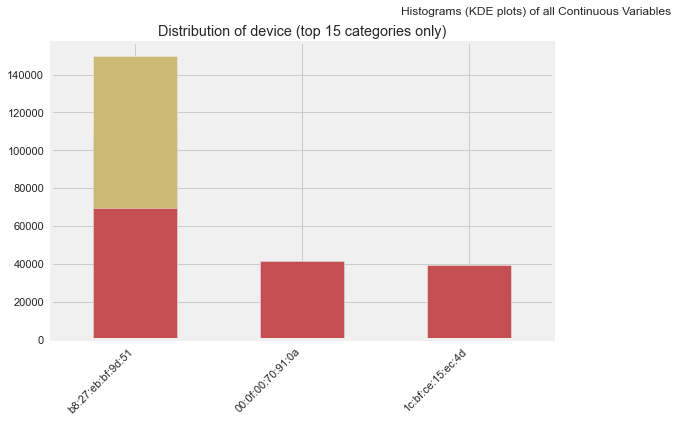
Frequency Distribution
Number of Observations by Device
device_counts = (
    df["device_name"]
    .value_counts()
    .rename_axis("device_name")
    .reset_index(name="count")
)

device_counts
Plot with Plotly:
fig = px.pie(
    device_counts,
    names="device_name",
    values="count",
    title="Number of Observations by Device"
)

fig.show()
Original output:
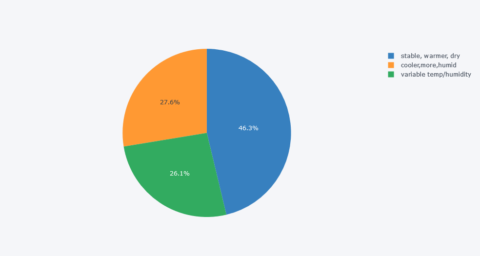
Insight
The device in the stable, warmer, and dry place had the highest number of records. This means the overall dataset may be biased toward that device.
That is why group-wise analysis is important.
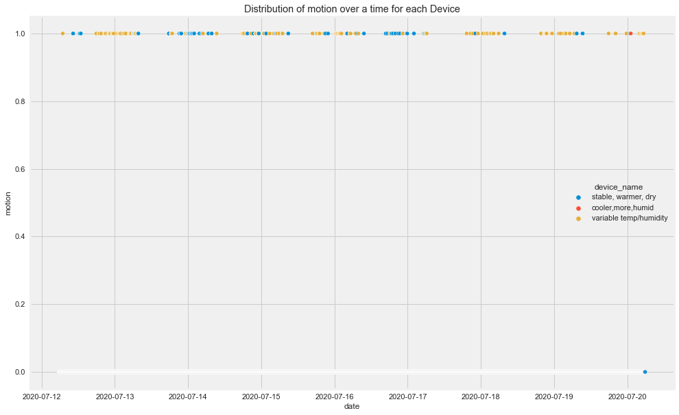
Distribution Over Time
We created a date column, so we can now inspect how each field changes over time.
sensor_cols = [
    "co",
    "humidity",
    "light",
    "lpg",
    "motion",
    "smoke",
    "temp",
]

for col in sensor_cols:
    plt.figure(figsize=(15, 8))

    sns.scatterplot(
        data=df,
        x="date",
        y=col,
        hue="device_name",
        s=8
    )

    plt.title(f"Distribution of {col} over time by device")
    plt.xlabel("Date")
    plt.ylabel(col)
    plt.show()
Original outputs:
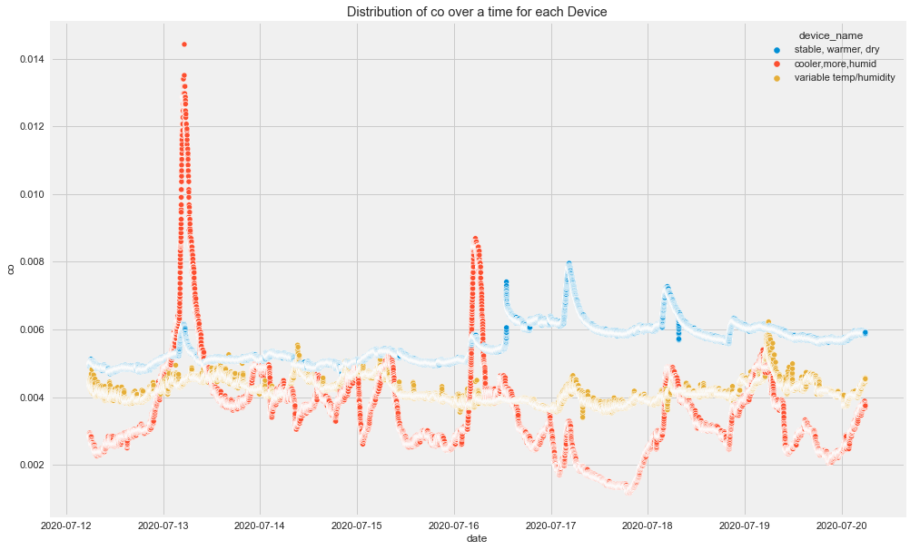
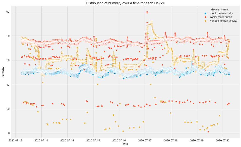
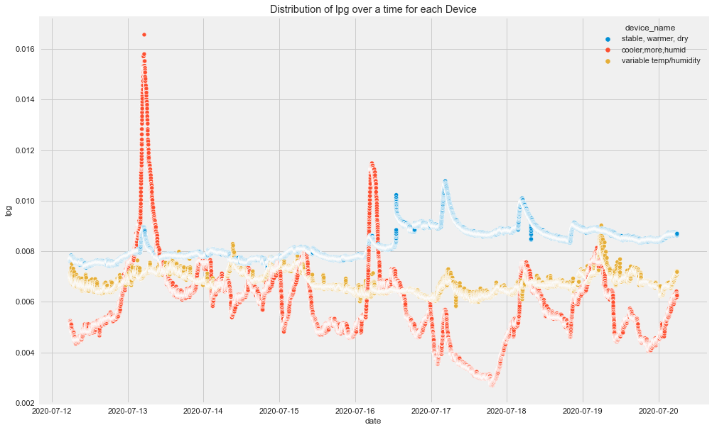
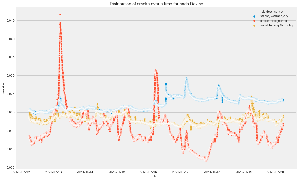
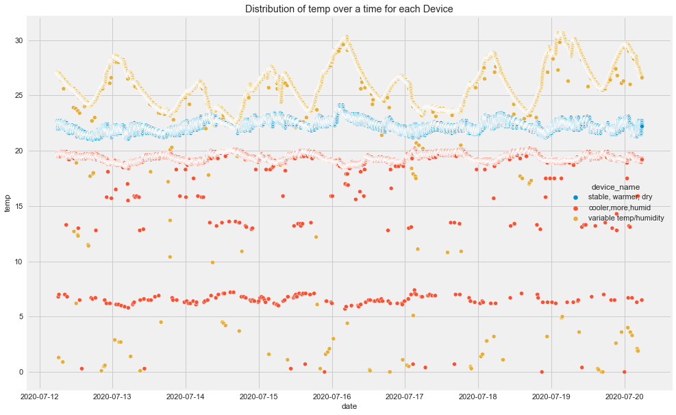
Time-Based Insights
From the original plots:
- CO had visible spikes for the cooler and more humid device.
- Humidity was different across devices.
- LPG decreased for the cooler, more humid device and increased for the stable, warmer, dry device.
- Different devices followed different patterns over time.
This already tells us that overall analysis may hide important group-level patterns.
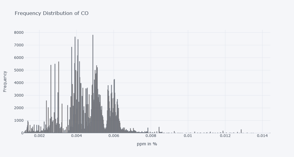
Distribution of a Single Column
For example, look at co.
fig = px.histogram(
    df,
    x="co",
    nbins=100,
    title="Frequency Distribution of CO"
)

fig.show()
Original Plotly output:
With seaborn:
plt.figure(figsize=(8, 5))

sns.histplot(
    data=df,
    x="co",
    bins=100
)

plt.title("Frequency Distribution of CO")
plt.xlabel("CO in ppm (%)")
plt.ylabel("Frequency")
plt.show()
Original output:
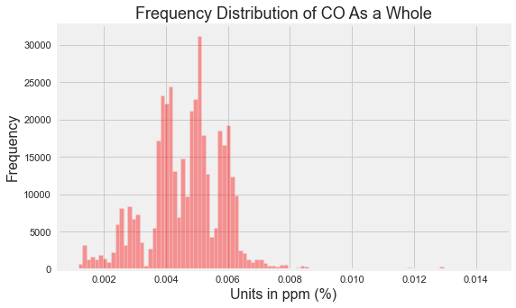
In older code, sns.distplot() was used. In newer seaborn versions, use sns.histplot() or sns.displot() instead.
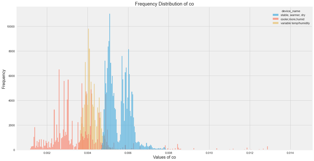
Distribution by Device
plt.figure(figsize=(18, 10))

sns.histplot(
    data=df,
    x="co",
    hue="device_name",
    bins=100
)

plt.title("Frequency Distribution of CO by Device")
plt.xlabel("CO in ppm (%)")
plt.ylabel("Frequency")
plt.show()
Original output:
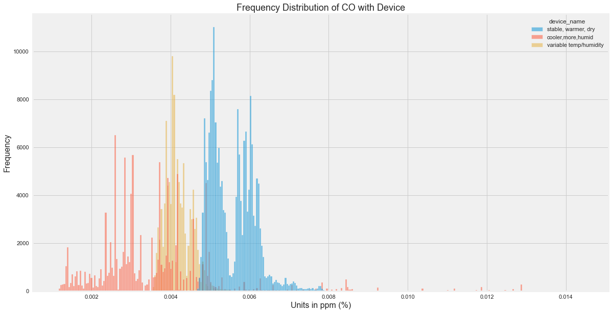
CO Insights
From the original analysis:
- Many CO readings were between 0.004 and 0.006.
- Some values were much higher and may be outliers.
- The stable, warmer, dry device recorded higher CO values overall.
Histograms for All Sensor Columns
for col in sensor_cols:
    plt.figure(figsize=(18, 10))

    sns.histplot(
        data=df,
        x=col,
        hue="device_name",
        bins=100
    )

    plt.title(f"Frequency Distribution of {col}")
    plt.xlabel(col)
    plt.ylabel("Frequency")
    plt.show()
Original outputs:
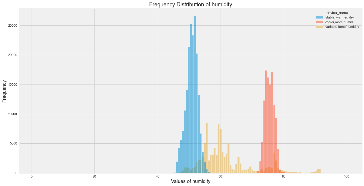
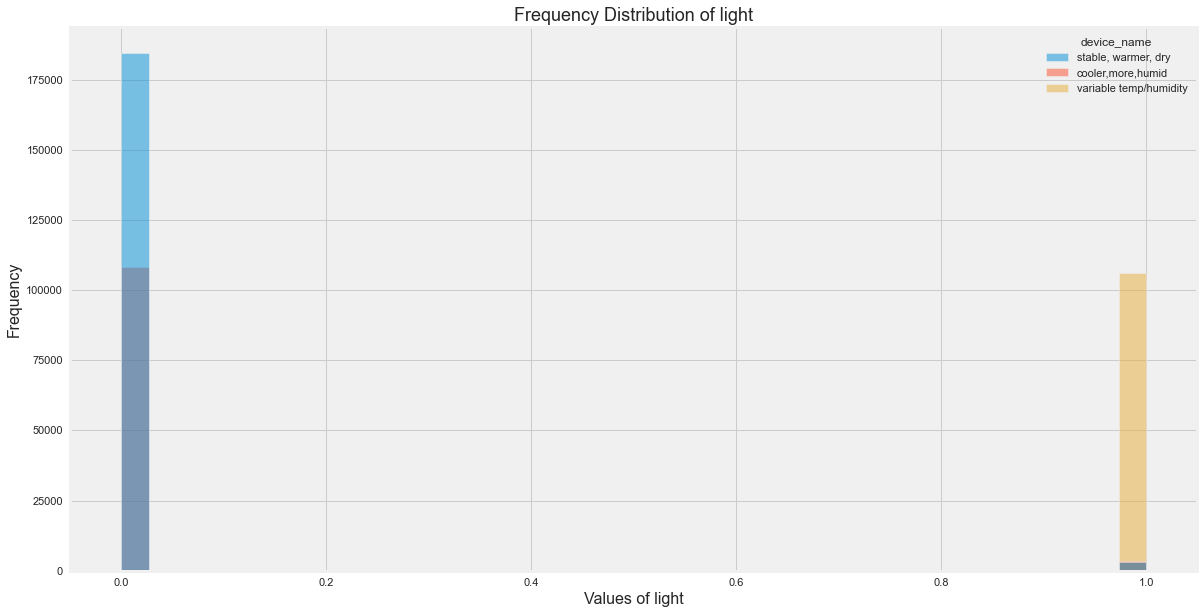
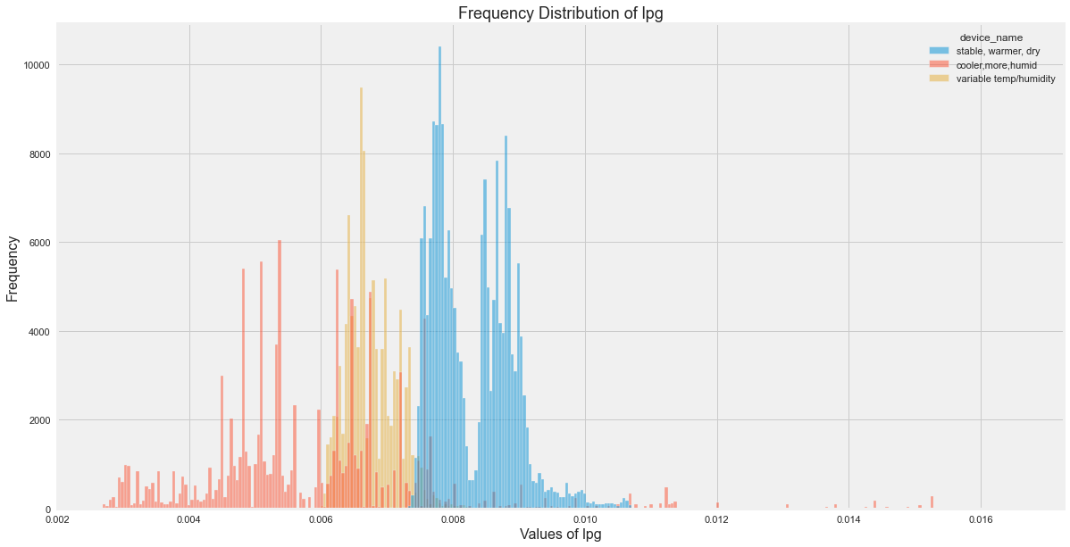
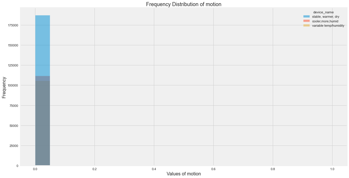
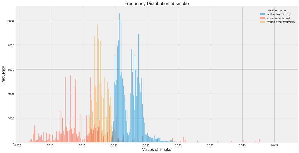
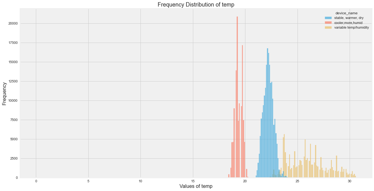
Distribution Insights
The original EDA showed:
- Temperature varied most for the variable temperature/humidity device.
- Smoke was more spread for the cooler device.
- LPG was also more spread for the cooler device.
- The three devices had clearly different environmental profiles.
Central Tendency and Spread
Use describe() to summarize numerical columns.
numeric_cols = [
    "co",
    "humidity",
    "lpg",
    "smoke",
    "temp",
]

df[numeric_cols].describe()
This gives:
- count
- mean
- standard deviation
- minimum
- quartiles
- maximum
Box Plot for Overall Data
df[numeric_cols].plot(
    kind="box",
    subplots=True,
    figsize=(16, 6),
    layout=(1, len(numeric_cols))
)

plt.tight_layout()
plt.show()
Original Plotly output:
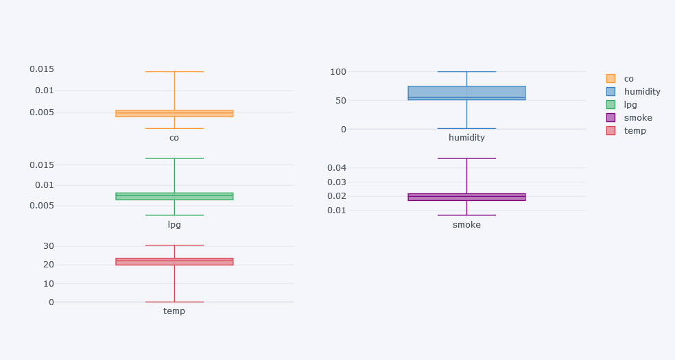
Box plots help us see:
- median
- spread
- skewness
- outliers
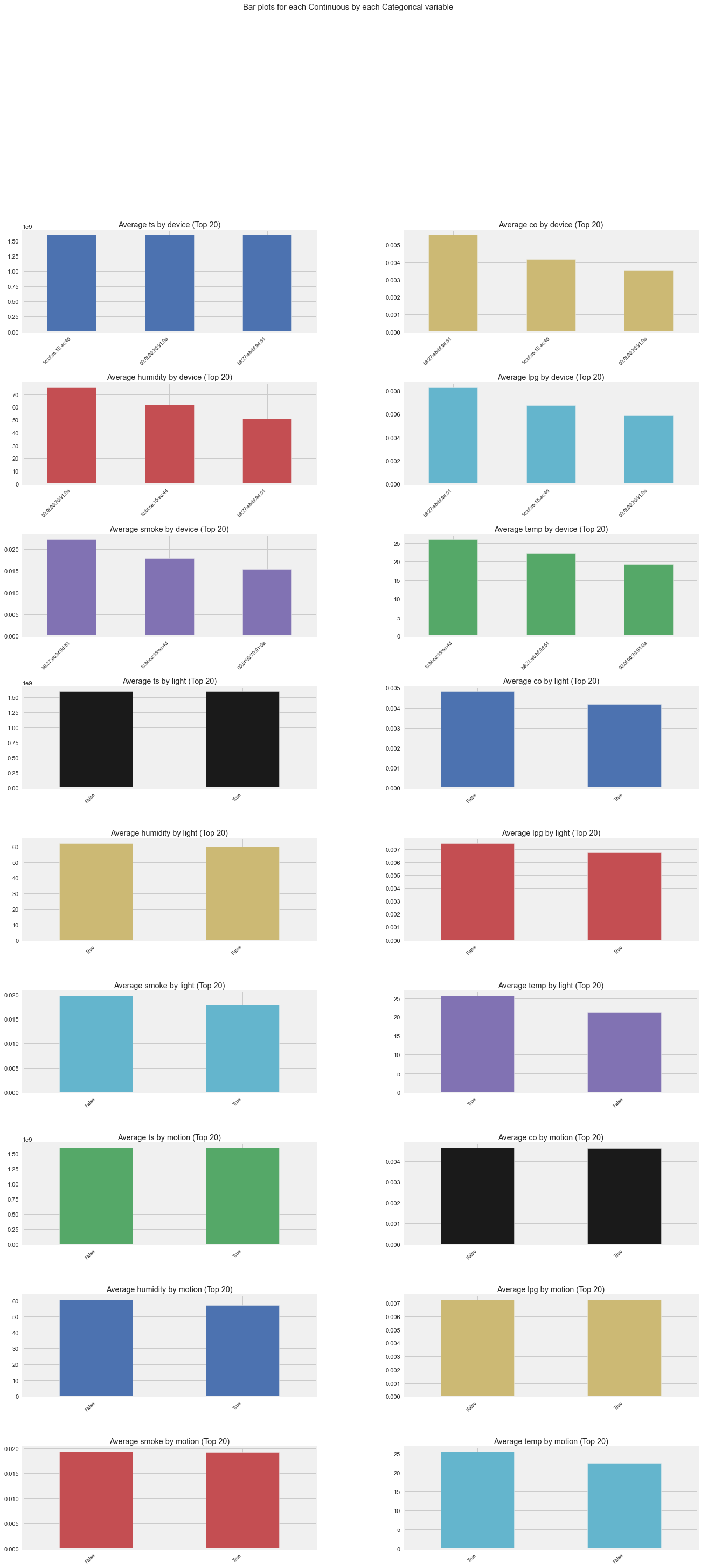
Group-Wise Descriptive Analysis
Overall statistics can be misleading because each device is placed in a different environment.
So, compare statistics by device.
df.groupby("device_name")[numeric_cols].describe()
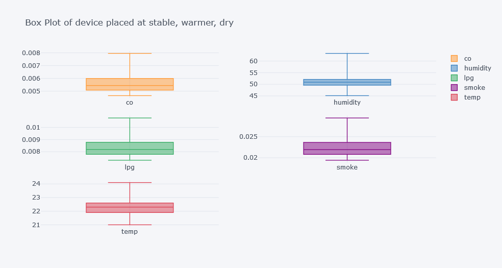
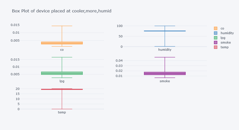
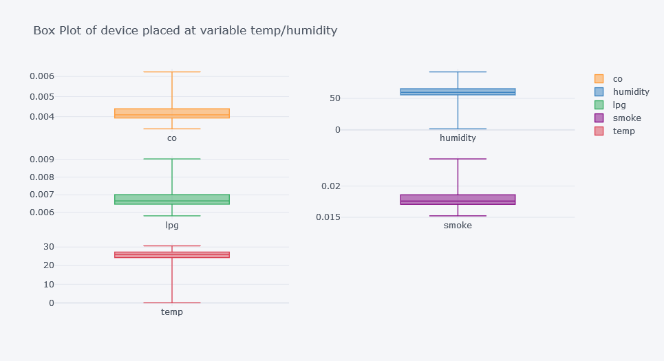
This produces a large table. For easier interpretation, plot box plots per device.
for device in df["device_name"].unique():
    subset = df[df["device_name"] == device]

    subset[numeric_cols].plot(
        kind="box",
        subplots=True,
        figsize=(16, 6),
        layout=(1, len(numeric_cols)),
        title=f"Box Plot for {device}"
    )

    plt.tight_layout()
    plt.show()
Original outputs:
Finding Outliers
Box plots are also useful for outlier detection.
for col in numeric_cols:
    plt.figure(figsize=(15, 8))

    sns.boxplot(
        data=df,
        x="device_name",
        y=col
    )

    plt.title(f"Box Plot of {col} by Device")
    plt.xticks(rotation=15)
    plt.show()
Original outputs:
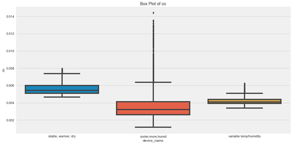
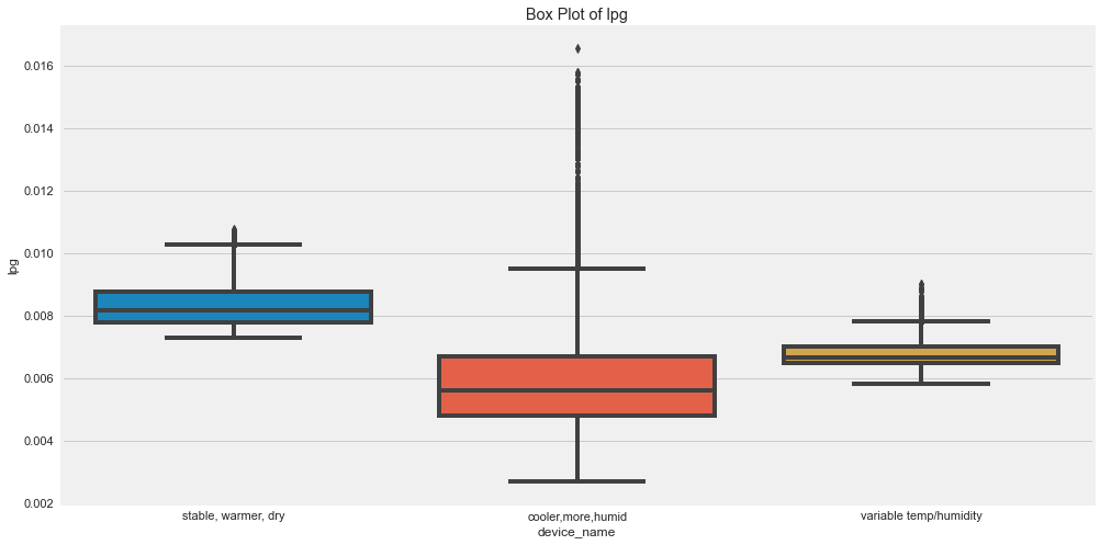
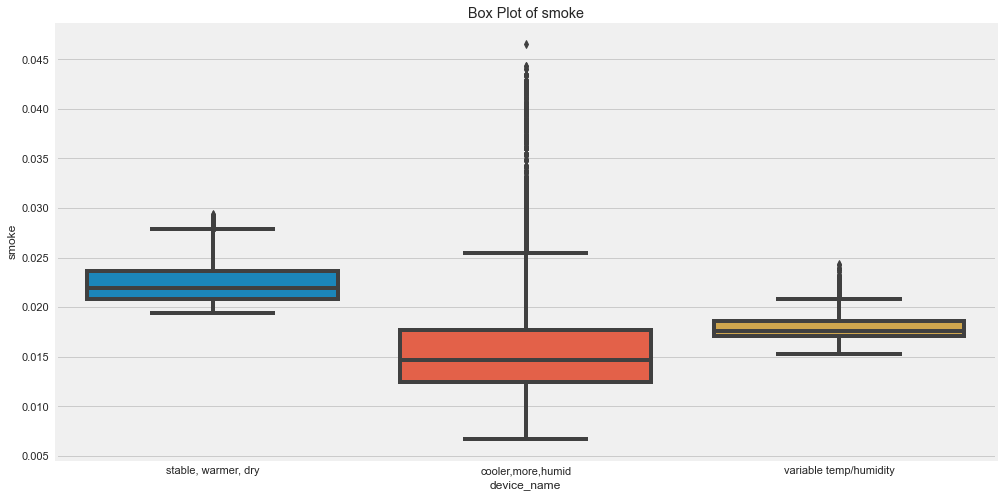
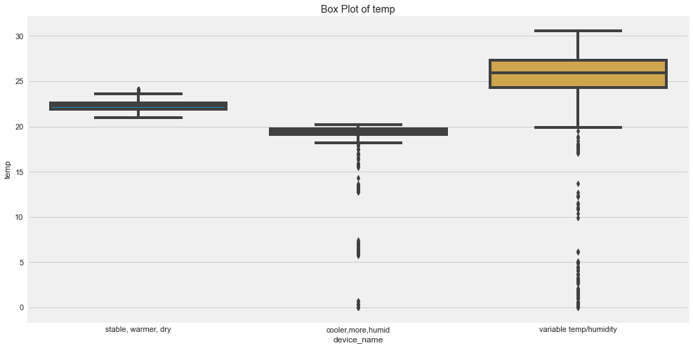
Outlier Insights
The original analysis suggested:
- CO had many outliers for the cooler, more humid device.
- Humidity had outliers for cooler, more humid and variable temp/humidity devices.
- LPG had outliers for the cooler, more humid device.
- Smoke had outliers for the cooler, more humid device.
- Temperature had outliers for the variable temp/humidity device.
Outliers are not always wrong. In sensor data, they may represent real events, sensor noise, or calibration issues.
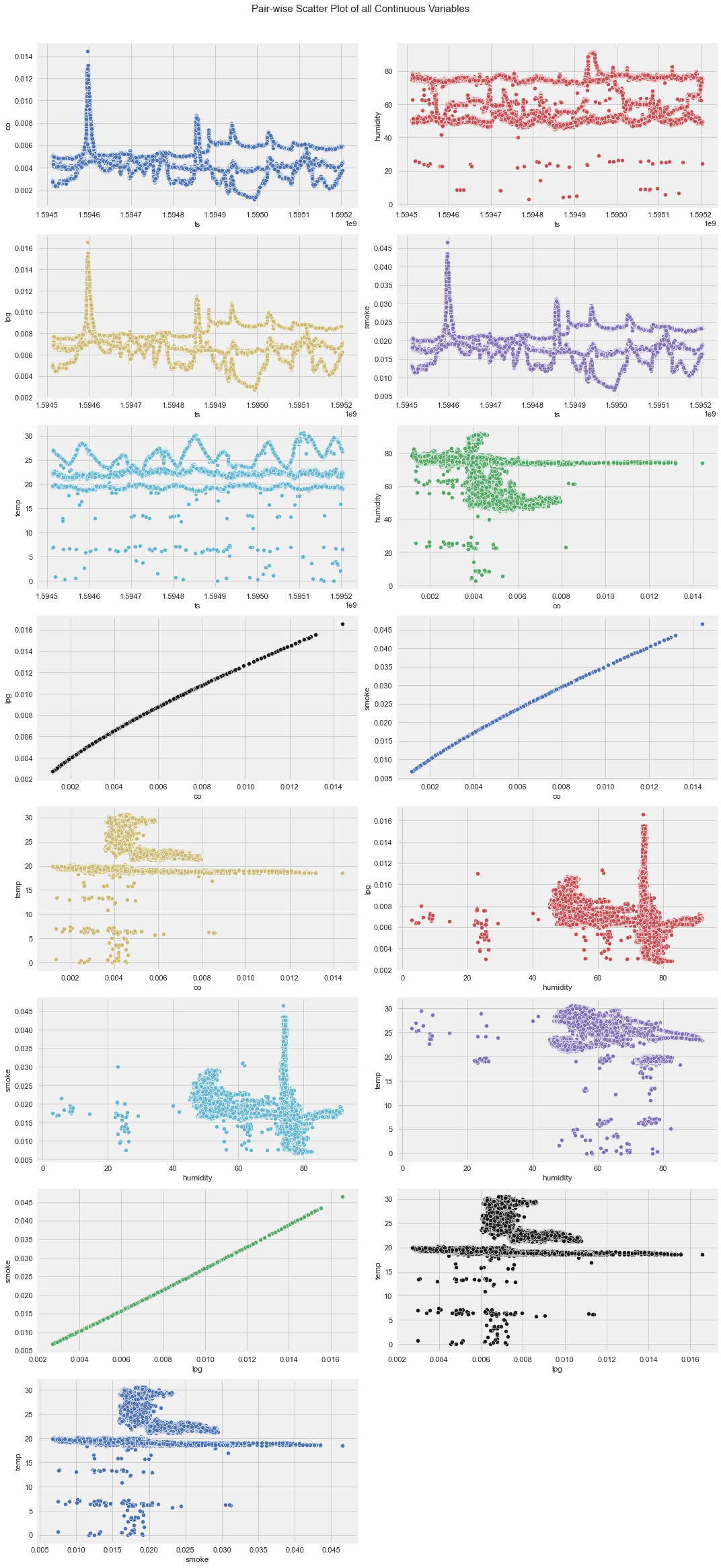
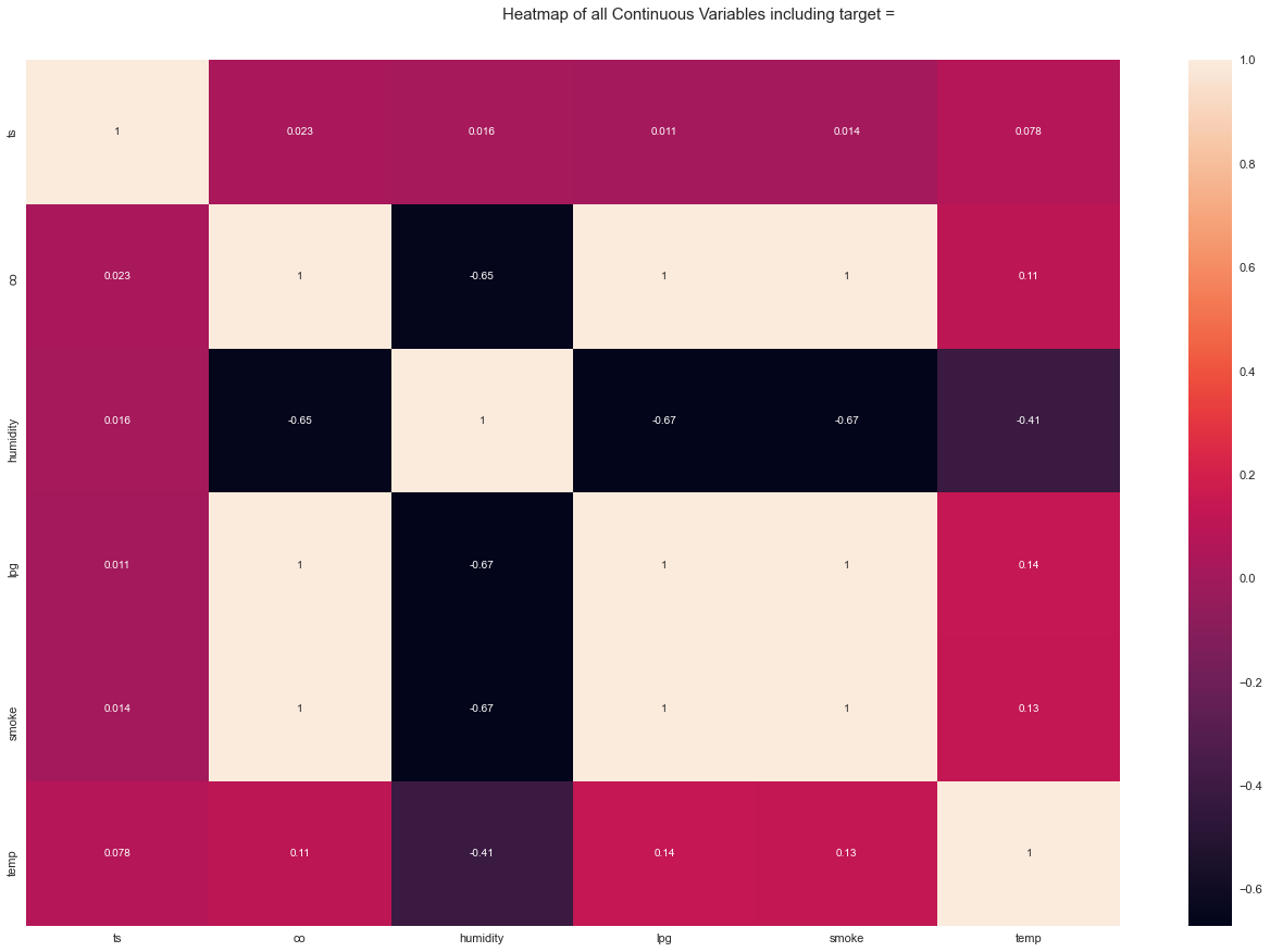
Correlation Analysis
Correlation measures how strongly two variables move together.
The most common correlation is Pearson correlation.
corr = df[numeric_cols + ["light_int", "motion_int"]].corr()

corr
Plot it:
plt.figure(figsize=(10, 8))

sns.heatmap(
    corr,
    annot=True,
    cmap="coolwarm",
    center=0
)

plt.title("Correlation Matrix")
plt.show()
Original output:
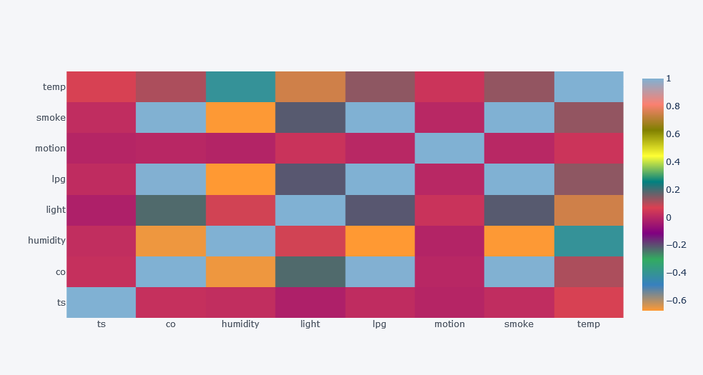
Overall Correlation Insights
From the original analysis:
- CO had high positive correlation with LPG and smoke.
- Humidity had negative correlation with CO, LPG, smoke, and temperature.
- Light had strong positive correlation with temperature.
- Smoke had very high positive correlation with LPG and CO.
Correlation by Device
Overall correlation may hide group-specific relationships. So, calculate correlation for each device separately.
for device in df["device_name"].unique():
    subset = df[df["device_name"] == device]

    corr = subset[numeric_cols + ["light_int", "motion_int"]].corr()

    plt.figure(figsize=(10, 8))

    sns.heatmap(
        corr,
        annot=True,
        cmap="coolwarm",
        center=0
    )

    plt.title(f"Correlation Matrix for {device}")
    plt.show()
Original outputs:
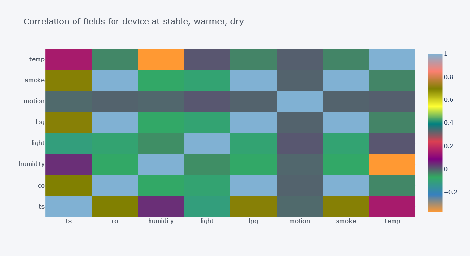
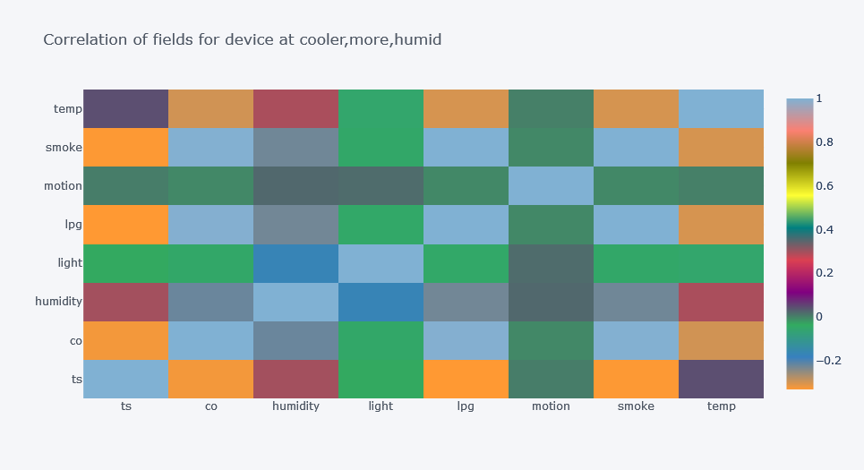
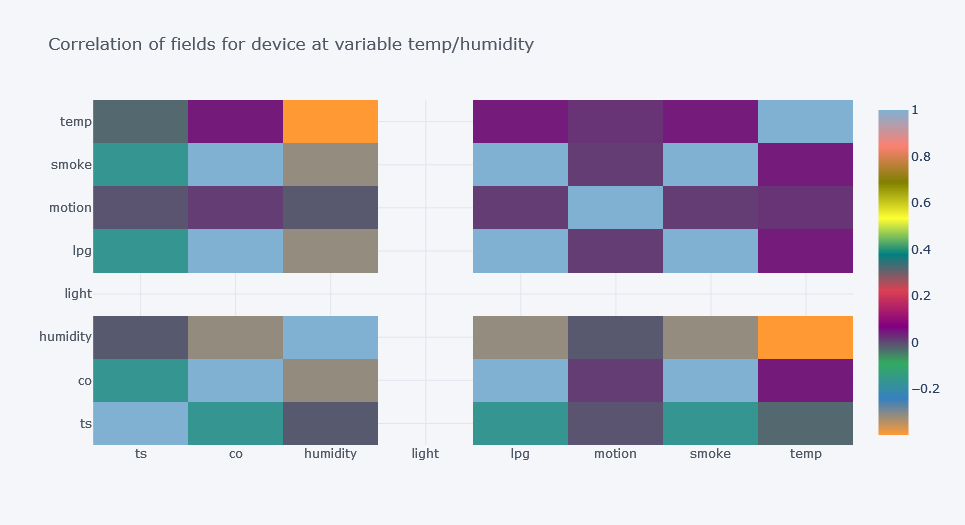
Device-Level Correlation Insights
The relationship between features changed by device.
For one device, time had positive correlation with smoke and CO. For other devices, the relationship was different or negative.
This is a major EDA lesson:
Do not trust only the overall correlation matrix when your dataset contains different groups.
Conclusion from Descriptive Analysis
From the descriptive analysis, we learned:
- The dataset is not balanced across devices.
- Each device is in a different environment.
- Feature distributions differ by device.
- Some columns have outliers.
- CO, LPG, and smoke are strongly related.
- Overall analysis hides important group-level differences.
This gives a strong basis for later modelling.
Inferential Data Analysis
Descriptive analysis tells us what happened in the data.
Inferential analysis asks whether the patterns are strong enough to support broader conclusions.
In inferential statistics, we often:
- take samples
- estimate population properties
- test hypotheses
- compare groups
- measure association
- decide whether differences are statistically significant
Sampling
Sampling means taking a smaller subset from a larger population.
This is useful when:
- the dataset is large
- full analysis is expensive
- we want to estimate population properties
- we want to test methods quickly
Take a sample:
sample_df = df.sample(
    n=10000,
    random_state=42
)
Compare sample statistics with population statistics.
population_stats = df[numeric_cols].describe()
sample_stats = sample_df[numeric_cols].describe()

population_stats - sample_stats
In the original experiment, the sample statistics were close to the population statistics, but not exactly the same.
That difference is called sampling error.
Point Estimation and Interval Estimation
Point Estimation
A point estimate gives one value.
Example:
Sample mean CO = 0.0046
Interval Estimation
An interval estimate gives a range.
Example:
Population mean CO may lie between 0.0045 and 0.0047
Confidence intervals are commonly used for interval estimation.
Hypothesis Testing
Hypothesis testing helps us test assumptions.
A typical test has:
- null hypothesis
- alternative hypothesis
- significance level
- test statistic
- p-value
- conclusion
Example:
H0: Mean temperature is the same for all devices.
H1: At least one device has a different mean temperature.
If the p-value is below the chosen alpha level, we reject the null hypothesis.
A common alpha value is:
0.05
This means a 5% significance level.
Types of Statistical Tests
| Test Type | Used For |
|---|---|
| Comparison tests | Compare groups |
| Correlation tests | Measure association |
| Regression tests | Estimate relationships |
| Non-parametric tests | Compare groups without strong distribution assumptions |
Comparison Tests
| Test | Parametric | Comparison | Number of Samples |
|---|---|---|---|
| t-test | Yes | mean | 2 |
| ANOVA | Yes | mean/variance | 3+ |
| Mann-Whitney U | No | rank distribution | 2 |
| Wilcoxon Signed Rank | No | paired distribution | 2 |
| Kruskal-Wallis H | No | rank distribution | 3+ |
| Mood’s Median | No | medians | 2+ |
ANOVA: Are Device Means Different?
We have three devices. We want to test whether the mean value of each numeric field is significantly different across devices.
Hypotheses:
H0: There is no difference in mean values between devices.
H1: At least one device has a different mean value.
Using statsmodels:
for col in numeric_cols:
    formula = f"{col} ~ C(device_name)"

    model = ols(
        formula,
        data=df
    ).fit()

    aov_table = anova_lm(
        model,
        typ=2
    )

    print(col)
    print(aov_table)
    print()
Using SciPy:
for col in numeric_cols:
    groups = [
        group[col].dropna()
        for _, group in df.groupby("device_name")
    ]

    result = stats.f_oneway(*groups)

    print(col, result)
In the original analysis, the p-values were very small. Therefore, we rejected the null hypothesis and concluded that the mean sensor readings were significantly different across devices.
Correlation Tests
Correlation tests measure association between variables.
| Test | Parametric | Data Type |
|---|---|---|
| Pearson correlation | Yes | interval/ratio |
| Spearman correlation | No | ordinal/interval/ratio |
| Chi-square test of independence | No | nominal/ordinal |
Pearson Correlation
Pearson correlation measures linear relationship.
The coefficient ranges from -1 to 1.
1means perfect positive linear relationship0means no linear relationship-1means perfect negative linear relationship
Pearson correlation formula:

From Wikipedia
We already used Pearson correlation in the descriptive analysis.
Spearman Correlation
Spearman correlation measures monotonic relationship. It is useful when the relationship is not strictly linear or when we do not want to assume normality.
Spearman formula:

From Wikipedia
Calculate Spearman correlation:
spearman_corr = df[numeric_cols + ["light_int", "motion_int"]].corr(
    method="spearman"
)

spearman_corr
In the original analysis, Spearman correlation again showed strong relationships between CO, LPG, and smoke.
Chi-Square Test
Chi-square test of independence is useful for categorical variables.
It is commonly used when we want to know whether two categorical variables are associated.
Hypotheses:
H0: The two variables are independent.
H1: The two variables are associated.
Example:
table = pd.crosstab(
    df["light"],
    df["motion"]
)

chi2, p_value, dof, expected = stats.chi2_contingency(table)

print("Chi-square:", chi2)
print("p-value:", p_value)
print("Degrees of freedom:", dof)
If p_value <= 0.05, we reject the null hypothesis and conclude that the variables are associated.
Collinearity and Multicollinearity
Correlation and collinearity are related but not exactly the same.
- Correlation measures relationship between two variables.
- Collinearity happens when two predictor variables are strongly linearly related.
- Multicollinearity happens when multiple predictor variables are linearly related.
Multicollinearity can make regression models unstable because it becomes hard to separate the individual effect of each feature.
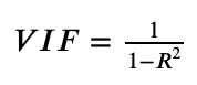
Variance Inflation Factor
Variance Inflation Factor, or VIF, helps detect multicollinearity.
A common interpretation is:
| VIF | Meaning |
|---|---|
| 1 | no correlation |
| 1 to 5 | moderate correlation |
| above 5 | high correlation |
| above 10 | serious concern |
VIF formula uses R2 from regressing one feature against the other features.
Calculate VIF Manually
def calculate_vif(data, features):
    """Calculate VIF and tolerance for selected features."""
    vif_values = {}
    tolerance_values = {}

    for feature in features:
        other_features = [
            f for f in features
            if f != feature
        ]

        X = data[other_features]
        y = data[feature]

        r2 = LinearRegression().fit(X, y).score(X, y)

        tolerance = 1 - r2
        vif = 1 / tolerance

        tolerance_values[feature] = tolerance
        vif_values[feature] = vif

    return pd.DataFrame({
        "VIF": vif_values,
        "Tolerance": tolerance_values
    })
Use it:
vif_df = calculate_vif(
    data=df,
    features=numeric_cols + ["light_int", "motion_int"]
)

vif_df
In the original analysis, CO, LPG, and smoke had very high VIF values. This confirms the strong multicollinearity between these fields.
What to Do with Multicollinearity?
Possible actions:
- remove one of the highly correlated features
- combine related features
- use PCA
- use regularized models such as Ridge or Lasso
- use tree-based models if interpretation of coefficients is not the main goal
For example, remove co and calculate VIF again:
features_without_co = [
    col for col in numeric_cols + ["light_int", "motion_int"]
    if col != "co"
]

calculate_vif(
    data=df,
    features=features_without_co
)
The original result showed that removing one gas-related variable reduced VIF values for the others.
Regression Tests
Regression tests estimate relationships between dependent and independent variables.
| Regression Type | Predictor | Outcome |
|---|---|---|
| Simple Linear Regression | 1 interval/ratio predictor | 1 interval/ratio outcome |
| Multiple Linear Regression | 2+ interval/ratio predictors | 1 interval/ratio outcome |
| Logistic Regression | 1+ predictors | binary outcome |
| Nominal Regression | 1+ predictors | nominal outcome |
| Ordinal Regression | 1+ predictors | ordinal outcome |
In this dataset, CO, LPG, and smoke are highly related. That can later become a modelling question, such as:
Can we predict CO from LPG and smoke?
This is continued in the next modelling blog.
Automated EDA Tools
Manual EDA is important because it gives deeper understanding. But automated EDA tools can quickly generate summaries and plots.
Examples:
- AutoViz
- ydata-profiling or its current successor package
- Sweetviz
- D-Tale
AutoViz Example
from autoviz.AutoViz_Class import AutoViz_Class

av = AutoViz_Class()

report_df = av.AutoViz(
    "iot_telemetry_data.csv"
)
Original AutoViz outputs:
AutoViz can quickly generate many plots, but it should not replace manual thinking.
Profiling Report Example
A profiling report can summarize a dataset with one command.
Example with newer profiling import style:
from ydata_profiling import ProfileReport

profile = ProfileReport(
    df,
    title="IoT Telemetry Data Profiling Report",
    explorative=True
)

profile.to_file("eda_report.html")
Older notebooks may use:
from pandas_profiling import ProfileReport
If that fails, check the current package name and migration instructions.
Practical EDA Checklist
Here is a simple checklist you can reuse.
1. Basic Checks
df.shape
df.head()
df.info()
df.describe()
df.isna().sum()
2. Data Types
Check:
- numeric columns
- categorical columns
- boolean columns
- datetime columns
3. Missing Values
Check:
- missing count
- missing percentage
- missing patterns by group
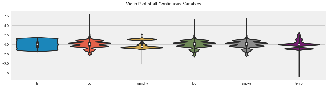
4. Distributions
Use:
- histograms
- KDE plots
- box plots
- violin plots
5. Group Comparisons
Compare distributions by:
- class
- device
- location
- time period
- category
6. Correlations
Check:
- Pearson correlation
- Spearman correlation
- correlation by group
- multicollinearity
7. Outliers
Use:
- box plots
- IQR rule
- z-score
- domain-specific limits
8. Statistical Tests
Use tests only when the question is clear.
Examples:
- t-test for two group means
- ANOVA for 3+ group means
- Chi-square for categorical association
- correlation tests for association
9. Write Insights
For every plot, write a sentence:
What does this show?
Why does it matter?
What should we check next?
EDA without written insight is just plotting.
Common EDA Mistakes
Mistake 1: Looking Only at Overall Data
Overall summaries can hide group-level patterns. Always check important groups separately.
Mistake 2: Ignoring Data Meaning
A column name is not enough. Understand units, collection method, and real-world context.
Mistake 3: Treating Outliers as Errors
Outliers may be real events. Investigate before removing them.
Mistake 4: Confusing Correlation with Causation
Correlation means variables move together. It does not prove that one causes the other.
Mistake 5: Using Deprecated Code
Older tutorials may use deprecated functions such as sns.distplot() or old profiling package names. Update code when needed.
Mistake 6: Not Saving Findings
Write down insights clearly. Good EDA should create a story.
Key Findings from This Dataset
From this EDA, we found:
- The dataset has no missing values.
- The devices have different numbers of records.
- Each device was placed in a different environment.
- Temperature and humidity patterns differ strongly by device.
- CO, LPG, and smoke are highly correlated.
- Overall correlation is not enough because device-level relationships differ.
- Some features have outliers, especially for the cooler, more humid device.
- ANOVA suggests sensor means differ significantly across devices.
- VIF shows strong multicollinearity among CO, LPG, and smoke.
These findings directly motivate the next step: modelling.
Final Thoughts
In this blog, we walked through a general way to perform Exploratory Data Analysis in Python. We loaded data, checked structure, transformed timestamps, created readable labels, analyzed distributions, studied outliers, compared devices, checked correlations, performed sampling, ran ANOVA, and calculated VIF.
The most important lesson is:
EDA is not just plotting. EDA is asking better questions about the data.
Good EDA helps us understand what is trustworthy, what is suspicious, what is useful, and what should be tested next.
In the next step, we can use these findings to build clustering, regression, and classification models.


Comments