
Python for Stock Market Analysis: Getting Started into Timeseries Analysis
Introduction
This is the part 4 of our Python for Stock Market Analysis series and here, we will be getting started with timeseries analysis. This part will not be exploring any prediction techniques yet as we will explore fundamental concepts in timeseries.
Making Things Ready
Here, we will import
- Pandas for data analysis, install as
pip install pandas. - Plotly for interactive visualization, install as
pip install plotly. - Cufflinks to use plotly graphs from pandas dataframe, install as
pip install cufflinks. - Yfinance to download daily floorsheet data of stock market, install as
pip install yfinance. - Statsmodels to make time series models.
import pandas as pd
import plotly.express as px
import cufflinks
import plotly.io as pio
import yfinance as yf
import warnings
import matplotlib.pyplot as plt
import seaborn as sns
sns.set()
from statsmodels.graphics.tsaplots import plot_acf, plot_pacf
from statsmodels.tsa.arima_model import ARMA, ARIMA
import statsmodels.api as sm
warnings.filterwarnings("ignore")
cufflinks.go_offline()
cufflinks.set_config_file(world_readable=True, theme='pearl')
pio.renderers.default = "notebook" # should change by looking into pio.renderers
sns.set(rc={'figure.figsize':(40, 20)})
plt.rc("figure", figsize=(16,8))
pd.options.display.max_columns = None
Read Data
symbols = ["AAPL"]

df = yf.download(tickers=symbols)
df.head()
NumExpr defaulting to 8 threads.


[*********************100%***********************]  1 of 1 completed
| Open | High | Low | Close | Adj Close | Volume | |
|---|---|---|---|---|---|---|
| Date | ||||||
| 1980-12-12 | 0.128348 | 0.128906 | 0.128348 | 0.128348 | 0.100323 | 469033600 |
| 1980-12-15 | 0.122210 | 0.122210 | 0.121652 | 0.121652 | 0.095089 | 175884800 |
| 1980-12-16 | 0.113281 | 0.113281 | 0.112723 | 0.112723 | 0.088110 | 105728000 |
| 1980-12-17 | 0.115513 | 0.116071 | 0.115513 | 0.115513 | 0.090291 | 86441600 |
| 1980-12-18 | 0.118862 | 0.119420 | 0.118862 | 0.118862 | 0.092908 | 73449600 |
# convert column names into lowercase
df.columns = [c.lower() for c in df.columns]
df.rename(columns={"adj close":"adj_close"},inplace=True)
There are few things we should be sure about before diving into the different models of timeseries.
- Does our data have low auto correlation?
- Does it resemble white noise?
- Does it resemble random walk?
Check for White Noise
White Noise is a series with mean that is constant with time, a variance that is also constant with time, and zero autocorrelation at all lags. We can’t forecast white noise.
A white noise time series is simply a sequence of uncorrelated random variables that are identically distributed. Stock returns are often modeled as white noise. So, with white noise, we cannot forecast future observations based on the past since autocorrelations at all lags are zero.
White noise data tends to have low auto correlation value.
A acf auto-correlation function is a best way to find out whether data follows white noise or not.
Auto-Correlation Function (ACF)
Auto-Correlation is just like a normal correlation but it is calculated with the series’s lagged version. By the lagged, we mean the series interval.
If the time series with N values can be expressed as as V0, V1, … VN, and at time t, Vt. An Auto-correlation of a series V with lag k can be calculated as,
Where,
- Vt is the value at t,
- N is the number of points in a series or number of periods.
- K is the number of points to lag.
Autocorrelation is holds two main benefits in time series analysis,
- It helps us to find whether the data follows white noise or not. If it does, we will be having very little Auto correlation.
- If data is not random, then we could calculate the appropriate time series model. Mainly, to find order in ARIMA.
Partial Auto-Correlation Function (PACF)
PACF is just like ACF except that it gives the correlation between two observations that the shorter lags between those observations do not explain. For example, the partial autocorrelation for lag 3 is only the correlation that lags 1 and 2 do not explain. In other words, the partial correlation for each lag is the unique correlation between those two observations after partialling out the intervening correlations. Taken from statisticsbyjim.
PACF is mostly useful during the Autoregressive model.
ACF plot allows us to determine whether an AR (Autoregressive) Model can be defined based on a series or not. And if we can, a PACF plot can help us to find the order of it.
fig, ax = plt.subplots(1,2, sharey=True)
plot_acf(df.close, lags=40, ax=ax[0])
plot_pacf(df.close, lags=40, ax=ax[1])
plt.show()
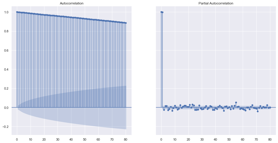
Looking over the ACF Plot, not all of the p-values are inside the shaded area which means that we can have a Auto Regressive model. Shaded area represents the non significant area. Thus, we can conclude that the data does not completely follow the white noise. Also, if we take a look into PACF, the lags at 1 and 2 are significantly higher than others and we can accept 1 or 2 as the order of AR model later on.
What is ACF and PACF of a Random Series?
rdf = np.random.randint(0,100, 10000)

fig, ax = plt.subplots(1,2, sharey=True)
plot_acf(rdf, lags=40, ax=ax[0])
plot_pacf(rdf, lags=40, ax=ax[1])
plt.show()
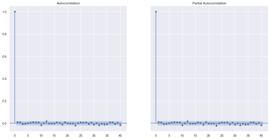
No surprise that theres is very little correlation seen in the random data. So we can not predict or forecast the data based on the past or previous data in this series.
References
Check for Random Walk
Random walk are not random numbers but it is the modification of the previous value in the sequence by some random number.
- In random walk, the current observation is a random step from the previous observation. For example, today’s value is equal to some random value + yesterday’s value.
- The change in price of a random walk is just White Noise.
- We can’t forecast the random walk.
One way to check for random walk is using Dicky-Fuller Test. Agumented version of DF test will be used here. For more about it, please visit here.
Few Concepts
To identify the nature of data, we will be using the null hypothesis.
- H0 (null hypothesis): It is a statement about the population that either is believed to be true or is used to put forth an argument unless it can be shown to be incorrect beyond a reasonable doubt.
- H1 (alternative hypothesis): It is a claim about the population that is contradictory to H0 and what we conclude when we reject H0.
In our case,
- Ho: It is random walk.
- H1: It is not random walk.
If the p-value is extremely small, we can easily reject the hypothesis that data follows a random walk at all levels of significance.
if result[1] <= 0.05:
    print("Strong evidence against the null hypothesis(Ho), reject the null hypothesis. Data is not a random walk.")
else:
    print("Weak evidence against null hypothesis, indicating data is a random walk.")
from statsmodels.tsa.stattools import adfuller

def adf(data):
    results = adfuller(data)
    print(f"ADF Statistic: {results[0]}")
    print(f"p-value: {results[1]}")
    print("Critical Values:")
    for key, value in results[4].items():
        print("\t%s: %.3f" % (key, value))
    if results[1] <= 0.05:
        print("Strong evidence against the null hypothesis(Ho), reject the null hypothesis. Data is not a random walk.")
    else:
        print("Weak evidence against null hypothesis, indicating data is a random walk.")
adf(df.close)
ADF Statistic: 5.837273316352054
p-value: 1.0
Critical Values:
	1%: -3.431
	5%: -2.862
	10%: -2.567
Weak evidence against null hypothesis, indicating data is a random walk.
It seems that our data resembles a random walk and thus we can not forecast such values.
Check for Stationarity
A random walk is a common type of non-stationary series. Seasonal series are also non-stationary.
If data is stationary, covariance of the sample will be equal regardless of start point. Which means data follows constant mean, constant variance.
Again, we use ADF Test.
The null hypothesis of the ADF test is that the time series is non-stationary. So, if the p-value of the test is less than the significance level (0.05) then we reject the null hypothesis and infer that the time series is indeed stationary.
By using the p-value calculated on above step, it is clear that the data is random walk and hence it is also a non stationary data. Thus it will become hard to model this type of data.
Stationary data has very little ACF.
Making non-stationary data stationary
By taking a returns of the data instead of the value. Returns simply is the percentage of change from the previous day.
adf(df.close.pct_change().dropna())
ADF Statistic: -29.21527720236316
p-value: 0.0
Critical Values:
	1%: -3.431
	5%: -2.862
	10%: -2.567
Strong evidence against the null hypothesis(Ho), reject the null hypothesis. Data is not a random walk.
Percentage change is dependent on the previous day’s value too, and hence any non stationary data will become stationary once we take the difference, percentage change etc from lagged version of itself. If it does not become stationary, we need to increase the value of the lag.
Seasonality In Data
Seasonality means the trends of repeating cycle on the data. Seasonality is often decomposed into trend, seasonal effect and residual.
Decompose data into:-
- Trend: Pattern in data.
- Seasonal: Cyclic pattern in the data.
- Residual: Error of prediction.
A seasonality can be either additive or multiplicative or unknown.
Naive decomposition:
- Additive: trend + seasonal + residual
- Multiplicative: trend * seasonal * residual
Lets check the seasonality in monthly basis.
# check for last 2000 days data
from statsmodels.tsa.seasonal import seasonal_decompose
sdec = seasonal_decompose(df.close[-2000:], model="additive", period=300)
sdec.plot()
plt.show()

sdec = seasonal_decompose(df.close[-2000:], model="multiplicative", period=300)
sdec.plot()
plt.show()
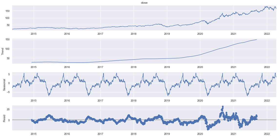
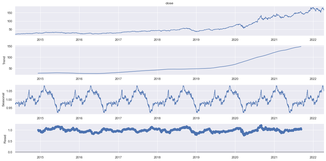
It seems that there are very narrow residuals in Multiplicative model whereas, the residuals seems to be spreaded a lot in additive. We can make some assumptions that our trend follows multiplicative seasonality.
EDA
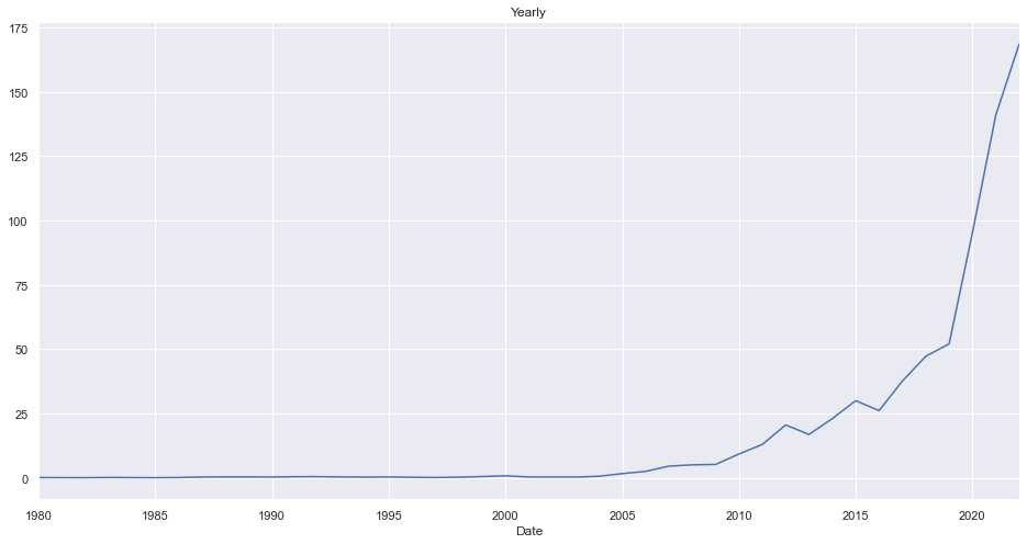
Yearwise Average Closing Price
ndf = df.copy().reset_index()
ndf.groupby(pd.Grouper(key="Date", freq="1Y")).close.mean().plot(kind="line", title="Yearly")
<AxesSubplot:title={'center':'Yearly'}, xlabel='Date'>
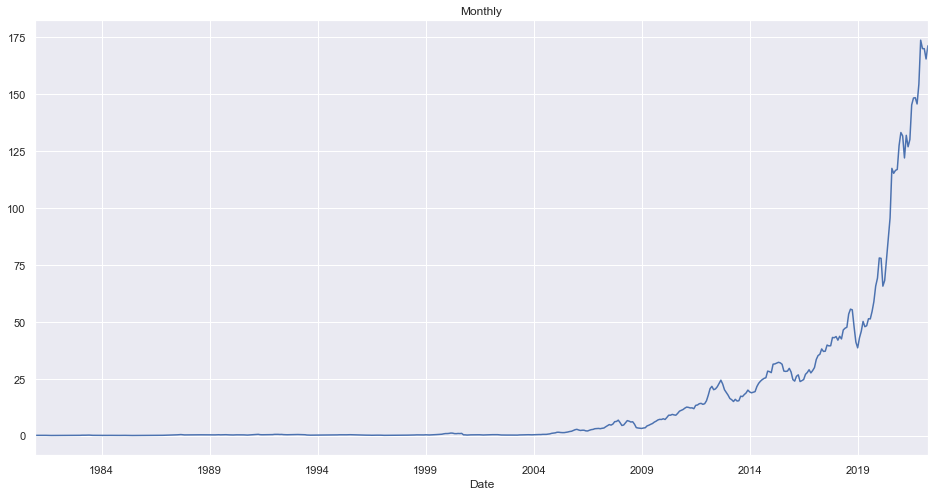
Monthly Average Closing Price
ndf.groupby(pd.Grouper(key="Date", freq="1M")).close.mean().plot(kind="line", title="Monthly")
<AxesSubplot:title={'center':'Monthly'}, xlabel='Date'>
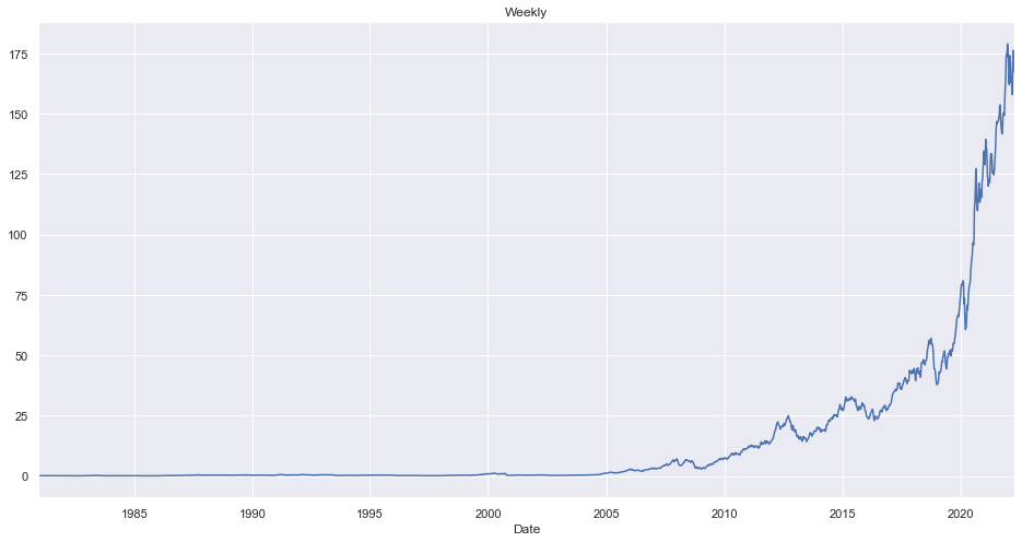
Weekly Average Closing Price
ndf.groupby(pd.Grouper(key="Date", freq="1W")).close.mean().plot(kind="line", title="Weekly")
<AxesSubplot:title={'center':'Weekly'}, xlabel='Date'>
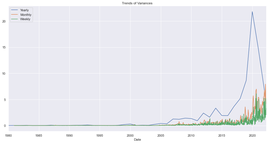
Variances Per W/M/Y
ndf.groupby(pd.Grouper(key="Date", freq="1Y")).close.std().plot(kind="line", title="Yearly")
ndf.groupby(pd.Grouper(key="Date", freq="1M")).close.std().plot(kind="line", title="Monthly")
ndf.groupby(pd.Grouper(key="Date", freq="1W")).close.std().plot(kind="line", title="Weekly")
plt.legend(["Yearly", "Monthly", "Weekly"])
plt.title("Trends of Variances")
plt.show()
Average Closing Price Per Year Per Month
mdf = ndf.query("Date>'2010'").groupby([pd.Grouper(key="Date", freq="1M")]).adj_close.mean().reset_index()
mdf["month"] = mdf.Date.dt.strftime('%B')
mdf["day"] = mdf.Date.dt.strftime('%A')
mdf["year"] = mdf.Date.dt.year


fig, ax = plt.subplots(figsize=(20,10))
palette = sns.color_palette("vlag", 4)
a = sns.barplot(x="year", y="adj_close",hue = 'month',data=mdf)
a.set_title("AAPL Closing Prices Year & Month Wise",fontsize=20)
plt.legend(loc='upper left',title="Month")
plt.show()
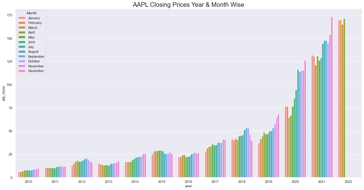
In recent years, the closing price has been increasing in closing months.
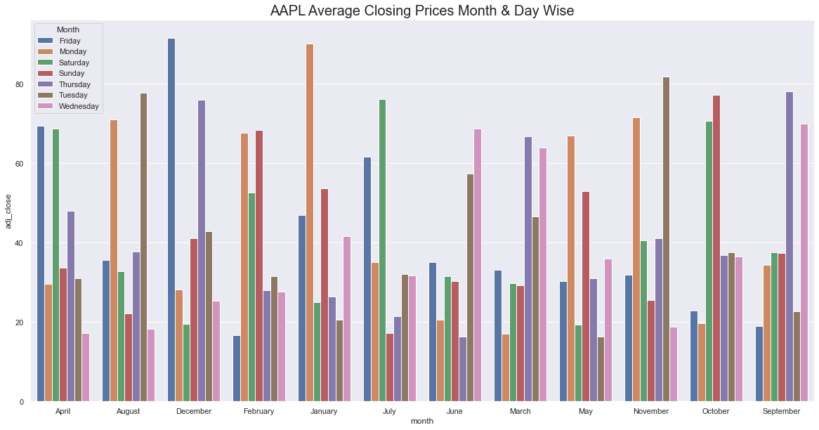
Average Closing Price Per Day Per Month
fig, ax = plt.subplots(figsize=(20,10))
palette = sns.color_palette("vlag", 4)
a = sns.barplot(x="month", y="adj_close",hue = 'day',data=mdf.groupby(["month", "day"]).adj_close.mean().reset_index())
a.set_title("AAPL Average Closing Prices Month & Day Wise",fontsize=20)
plt.legend(loc='upper left',title="Month")
plt.show()
Modeling
Metrics to Evaluate a Model
We will check the metrics like MAPE, ME, MAE, MPE, RMSE, CORR, MINs, MAXs, MINMAX and ACF to compare the results between predicted and true data.
MAPE (Mean Absolute Percentage Error)
It gives us the measurement of how accurate is our forecast value with compared to the real value.
\[MAPE = \frac{1}{n} \frac{\sum_{i}^{n}{|y_t-p_t|}}{p_t}\]ME (Mean Error)
It is simply an average of error.
\[ME = \frac{1}{n} \sum_{i}^{n}{y_t-p_t}\]MAE (Mean Absolute Error)
It is an average of error after taking and absolute.
\[MAE = \frac{1}{n} \sum_{i}^{n}{|y_t-p_t|}\]MPE (Mean Percentage Error)
Just like MAPE except we do not take Absolute.
\[MPE = \frac{1}{n} \frac{\sum_{i}^{n}{y_t-p_t}}{p_t}\]RMSE (Root Mean Squared Error)
It is most robust error as it is squared and then taken a root.
\[RMSE = \sqrt{\frac{1}{n} \sum_{i}^{n}{(y_t-p_t)^2}}\]Additionally, we will be using our custom metric, Percentage Change error. According to this metric, we will accept the percentage change of only 10% as valid.
# from statsmodels.tsa.stattools import acf

def forecast_metrics(forecast, actual):
    """
    forecast:
    actual:
    """
    mape = np.mean(np.abs(forecast - actual)/np.abs(actual))  # MAPE
    me = np.mean(forecast - actual)             # ME
    mae = np.mean(np.abs(forecast - actual))    # MAE
    mpe = np.mean((forecast - actual)/actual)   # MPE
    rmse = np.mean((forecast - actual)**2)**.5  # RMSE
    corr = np.corrcoef(forecast, actual)[0,1]   # corr
    mins = np.amin(np.hstack([forecast[:,None],
                              actual[:,None]]), axis=1)
    maxs = np.amax(np.hstack([forecast[:,None],
                              actual[:,None]]), axis=1)
    minmax = 1 - np.mean(mins/maxs)             # minmax
    acf1 = acf(forecast-actual)[1]                      # ACF1
    return({'mape':mape, 'me':me, 'mae': mae,
            'mpe': mpe, 'rmse':rmse, 'acf1':acf1,
            'corr':corr, 'minmax':minmax})

def pce(forecast, actual, threshold=10):
    pchange = 100*(forecast-actual)/actual
    acc = (pchange.abs()<threshold).sum()/len(pchange)
    return acc
Looking for Auto Regression
Thank you so much for getting to the end of this part. In the next part, we will explore different types of linear models like AR, MA, ARMA and ARIMA models.


Comments