
Creating Awesome Data Dashboard with Plotly in Streamlit: EDA
Data Dashboards are getting highly popular because the need to get insights from data is getting increased. One of the few ways we find the insights from the data is via dashboards. And for Data Analysts, there are options like tableau. But not all of them are for free. However, we can make some cool dashboards using Streamlit and in this blog, we will explore how.
This blog is just the beginning of creating a simple data dashboard with Plotly in Streamlit. Here we will only plot lines in this blog. Next blog will be about plotting maps. Please Stay TUNED.
Updates
- 2022/2/20: This blog
Installation
We have written a cool blog about getting started with Plotly and Cufflinks for making awesome analysis and plots in Jupyter Notebook. Please do not forget to read them.
pip install plotly cufflinks streamlit
First Streamlit App
For making a first streamlit app:
- We will simply create a new project folder (but it is not necessary)
- We will create a new Python file named as main.py inside it.
- Then inside that Python file we will add
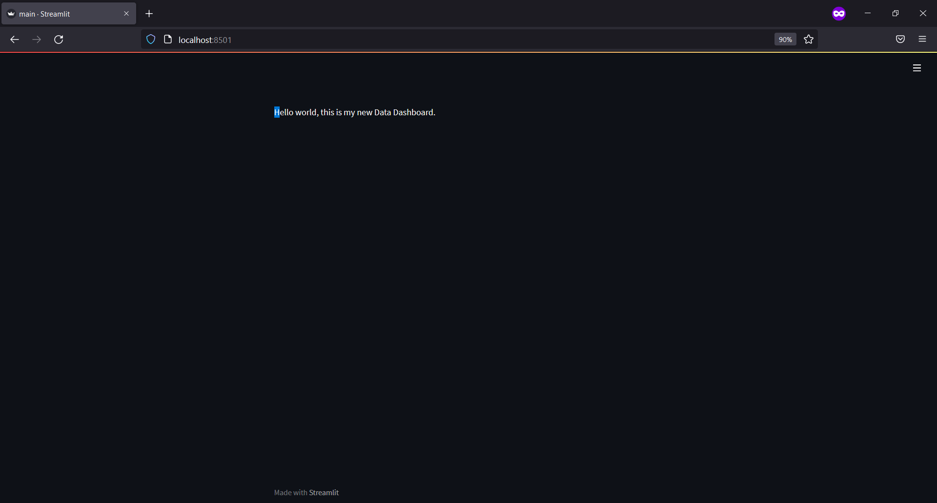
import streamlit as st

st.markdown("Hello world, this is my new Data Dashboard.")
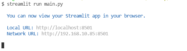
- Now saving a file and then from the project folder, we will run streamlit:
streamlit run main.py
- We could see something like below on the terminal:
- If the link does not open to the browser by itself, open it. And we could see our markdown text on the web page.
First Plotly Plot in Streamlit
It is relatively easier to plot graphs and plots in a Streamlit app than any other web apps. Let’s do it how.
- We will be making a data dashboard thus we will first prepare real world data.
- The data will be of COVID 19 data from this repository. The data is updated on a daily level thus your results can be different than ours in this blog.
Let’s put below code in our main.py file and see the changes in the browser by refreshing.
import streamlit as st
import numpy as np
import pandas as pd
import cufflinks
@st.cache
def get_data(url):
df = pd.read_csv(url)
df["date"] = pd.to_datetime(df.date).dt.date
df['date'] = pd.DatetimeIndex(df.date)
return df
url = "https://covid.ourworldindata.org/data/owid-covid-data.csv"
data = get_data(url)
daily_cases = data.groupby(pd.Grouper(key="date", freq="1D")).aggregate(new_cases=("new_cases", "sum")).reset_index()
fig = daily_cases.iplot(kind="line", asFigure=True,
x="date", y="new_cases")
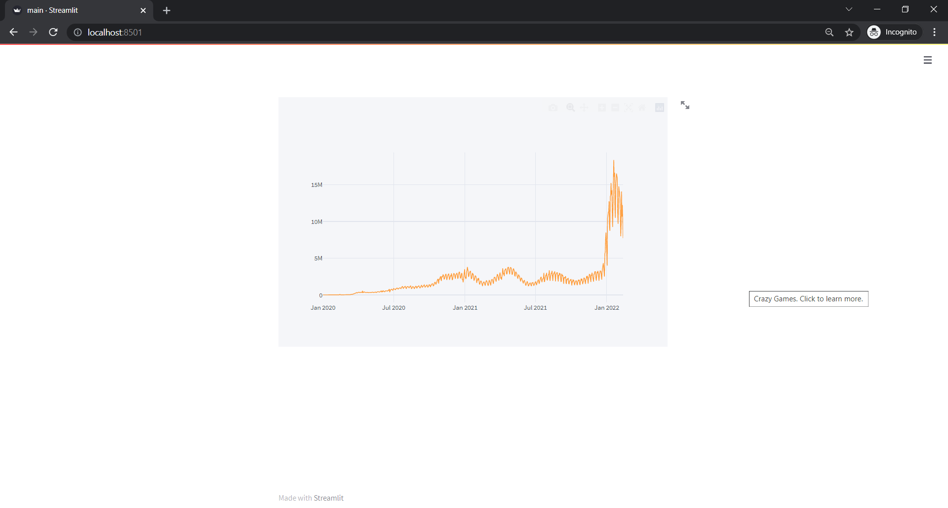
st.plotly_chart(fig)
In above code, we did:
- Imported NumPy, Pandas and Cufflinks.
- Read a csv file from a given URL inside a function along with a cache decorator. The reason to do so is that we do not want the csv file to be reloaded every time we make small changes in a source file.
- We made a date column with a date time index.
- We then aggregated data on daily level by finding a sum of new cases.
- We plotted a line plot using Pandas iplot attribute. Cufflinks allowed us to use iplot with Pandas object.
- To be able to use that figure in streamlit app, we used
asFigure=Trueiniplotand then passed figure insidest.plotly_chart
Adding Dropdown for Location
The above plot was for entire locations and if we look carefully to all the locations, there are values like World, Asia and so on which are aggregated values and if we want to view world’s daily trend, we must either filter out rows of locations like World, Asia or we must select rows with those values. But doing filter or selection inside a code will not be much of a good idea so lets make a drop down. Just below the function, we will modify code to look like below:
url = "https://covid.ourworldindata.org/data/owid-covid-data.csv"
data = get_data(url)
locations = data.location.unique().tolist()
sidebar = st.sidebar
location_selector = sidebar.selectbox(
"Select a Location",
locations
)
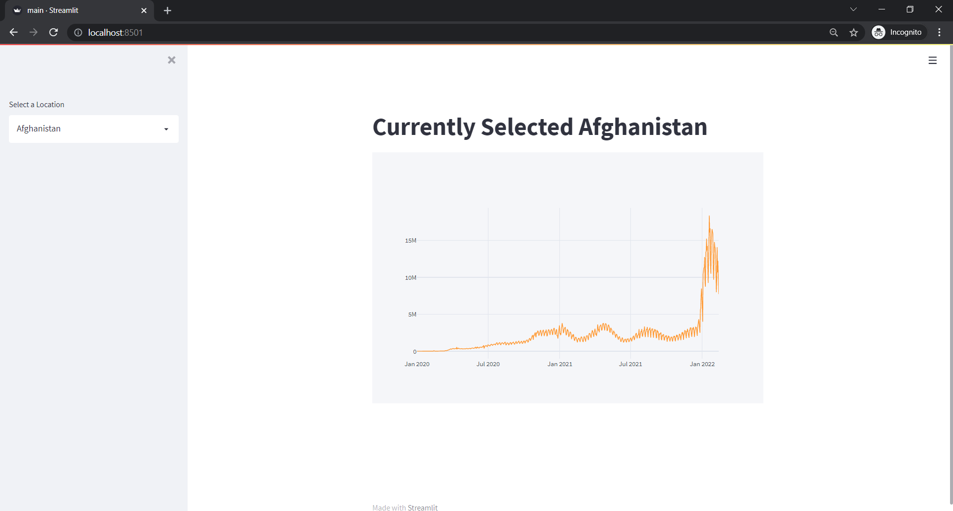
st.markdown(f"# Currently Selected {location_selector}")
daily_cases = data.groupby(pd.Grouper(key="date", freq="1D")).aggregate(new_cases=("new_cases", "sum")).reset_index()
fig = daily_cases.iplot(kind="line", asFigure=True,
x="date", y="new_cases")
st.plotly_chart(fig)
What we did is:
- Take a unique list of countries or locations from the above dataframe.
- Create a sidebar object to make our drop down visible on the sidebar.
- Create a selectbox in that sidebar and give options as
locations. - Then in markdown, show the currently selected location. Streamlit gives selected values in that selectbox.
We can see something like below:
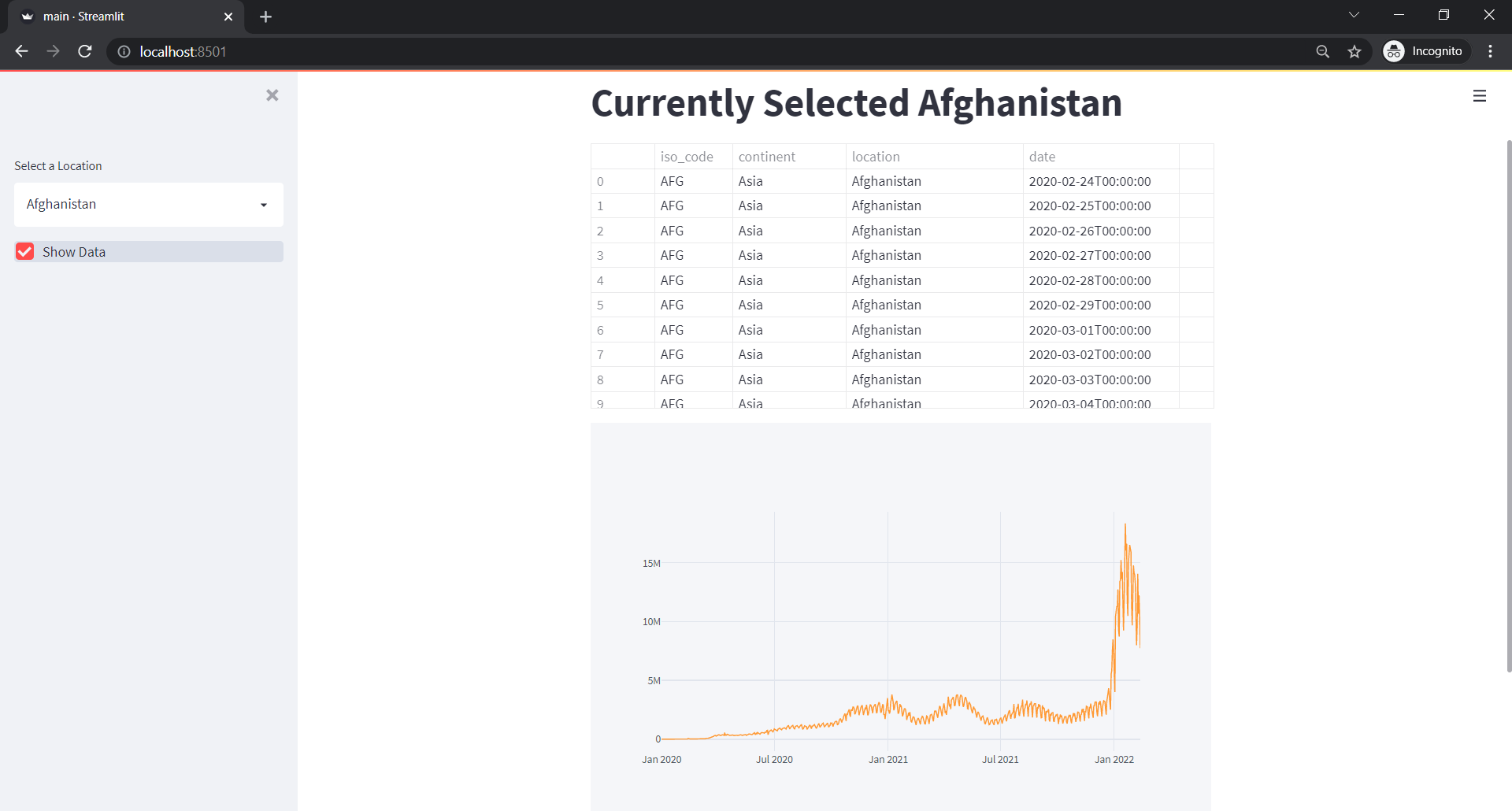
Adding A Checkbox to Show Data
It is even simpler. Add below code just below the markdown to show the location selected.
show_data = sidebar.checkbox("Show Data")

if show_data:
    st.dataframe(data)

daily_cases = data.groupby(pd.Grouper(key="date", freq="1D")).aggregate(new_cases=("new_cases", "sum")).reset_index()
fig = daily_cases.iplot(kind="line", asFigure=True,
                        x="date", y="new_cases")
st.plotly_chart(fig)
We created a checkbox on the sidebar and if it is clicked, we will push the data in st.dataframe. Below is the result in the web app.
But the data is not very readable. So let’s create a new drop down, where we will select the type of trend. But let’s first create possible metrics or trend of data that we want visualize:
- Daily Cases: How many cases were there on a daily level?
- Daily Deaths: How many deaths were there on a daily level?
- Daily Tests: How many of the tests were there on a daily level?
- Daily Vaccination: How many of the daily vaccinations were there on a daily level?
In above 4 metrics, we could make weekly, monthly, quarterly and yearly level aggregations easily so lets make it as a whole.
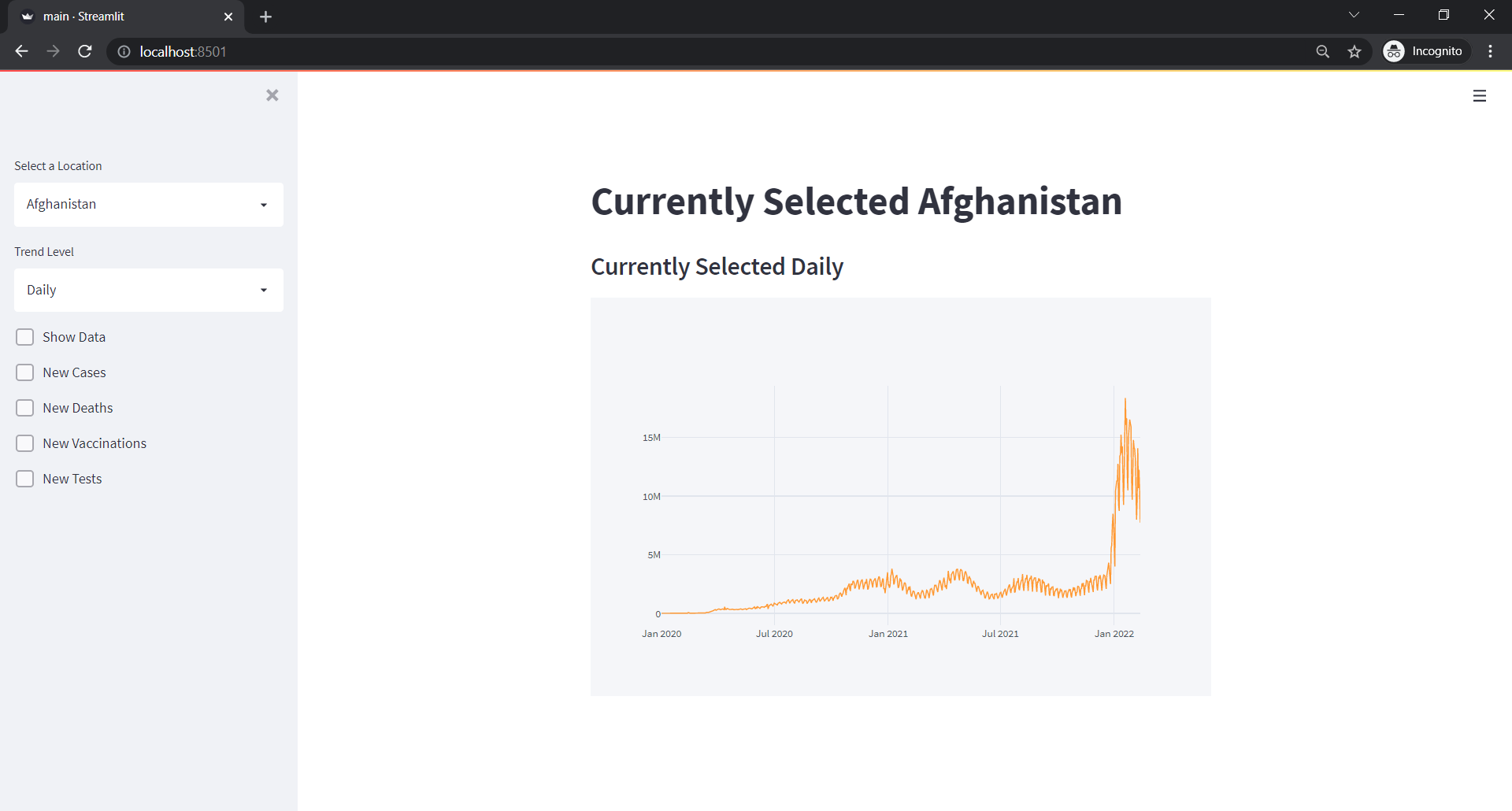
Date Level Trend Data
Just below the locations line, we will create code something like below:
sidebar = st.sidebar
location_selector = sidebar.selectbox(
"Select a Location",
locations
)
st.markdown(f"# Currently Selected {location_selector}")
trend_level = sidebar.selectbox("Trend Level", ["Daily", "Weekly", "Monthly", "Quarterly", "Yearly"])
st.markdown(f"### Currently Selected {trend_level}")
show_data = sidebar.checkbox("Show Data")
trend_kwds = {"Daily": "1D", "Weekly": "1W", "Monthly": "1M", "Quarterly": "1Q", "Yearly": "1Y"}
trend_data = data.query(f"location=='{location_selector}'").\
groupby(pd.Grouper(key="date",
freq=trend_kwds[trend_level])).aggregate(new_cases=("new_cases", "sum"),
new_deaths = ("new_deaths", "sum"),
new_vaccinations = ("new_vaccinations", "sum"),
new_tests = ("new_tests", "sum")).reset_index()
trend_data["date"] = trend_data.date.dt.date
new_cases = sidebar.checkbox("New Cases")
new_deaths = sidebar.checkbox("New Deaths")
new_vaccinations = sidebar.checkbox("New Vaccinations")
new_tests = sidebar.checkbox("New Tests")
lines = [new_cases, new_deaths, new_vaccinations, new_tests]
line_cols = ["new_cases", "new_deaths", "new_vaccinations", "new_tests"]
trends = [c[1] for c in zip(lines,line_cols) if c[0]==True]
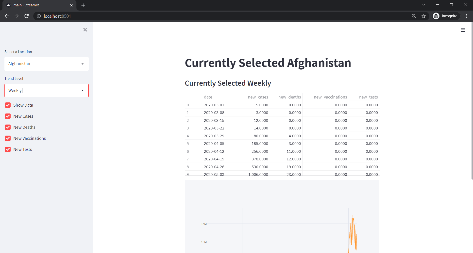
if show_data:
tcols = ["date"] + trends
st.dataframe(trend_data[tcols])
daily_cases = data.groupby(pd.Grouper(key="date", freq="1D")).aggregate(new_cases=("new_cases", "sum")).reset_index()
fig = daily_cases.iplot(kind="line", asFigure=True,
x="date", y="new_cases")
st.plotly_chart(fig)
What we did in above code is:
- Created a selectbox for selecting a trend level, daily, weekly, monthly, quarterly and yearly.
- Then we also showed the selected level in 3rd heading level in markdown.
- We have already made a show data checkbox.
- We also prepared keywords for each level. This keywords dictionary is used while taking a group on respective date level. So
1Dis for daily andWis for weekly and so on. We will select a trend level as a key to this dictionary and pass the value of this dictionary as a Grouper’s frequency later. - We took data of the currently selected location and then grouped the filtered data according to the given trend level. Then calculated summed values of new deaths, new vaccinations, new cases and new tests on that level.
- We also make the date column more like a normalized form.
- We made a separate checkbox for each of the above-created trend data columns.
- We will plot a line, thus we created another list
lines, holding all the checkbox variables we created on the previous step. - We also created another list,
line_colswhere we kept the name of the columns from atrend_datawith respect to thelineslist’s checkboxes. - We created another list
trendand we will put those column names from thelineslist for which its respective checkbox is checked on. - If the checkbox show_data is checked on, then we will show the data but show only those columns which are checked on.
The result should look like below:
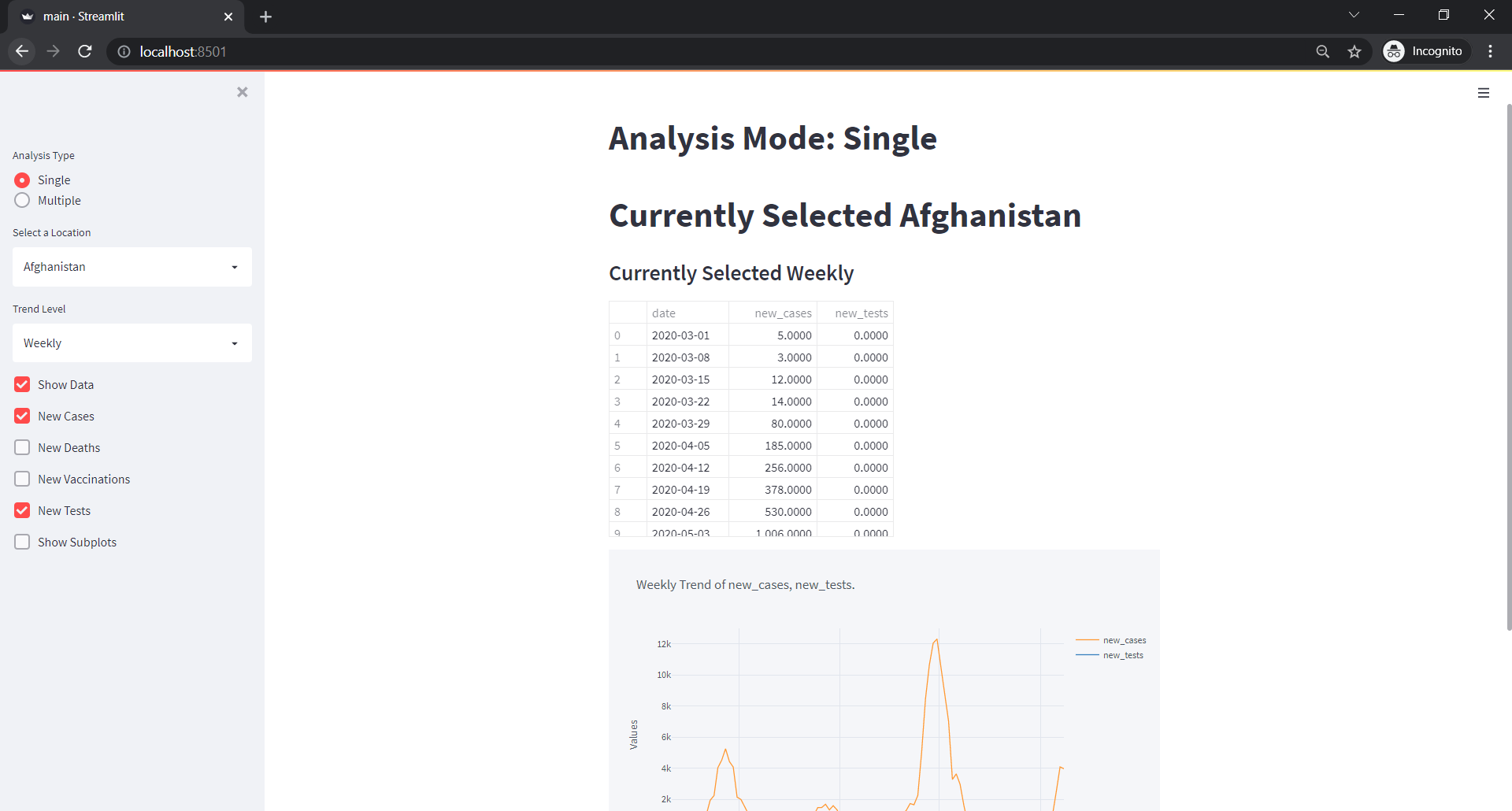
And if we selected all the columns with weekly trend of Afghanistan,
Date Level Trend Visualization
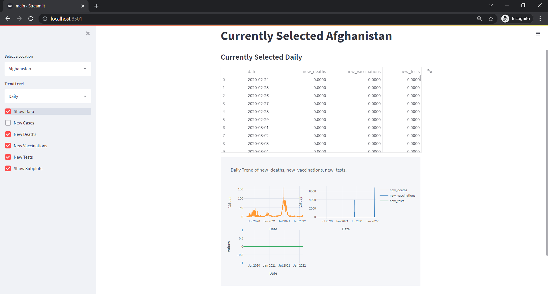
In the above web app, our dashboard contained only a data table and a plot that we initially created. But now, let’s create a visualization of that as well.
Let’s put the code below just below where we showed our data.
subplots=sidebar.checkbox("Show Subplots", True)
if len(trends)>0:
    fig=trend_data.iplot(kind="line", asFigure=True, xTitle="Date", yTitle="Values",
                         x="date", y=trends, title=f"{trend_level} Trend of {', '.join(trends)}.", subplots=subplots)
    st.plotly_chart(fig, use_container_width=False)
But remove the code of visualization we added earlier.
We can see something like below:
Comparison Between N Countries
In the above plots, we were only plotting plots of a single location but what if we want to compare between two by viewing the same on the same figure? This is not possible by default so we will tweak the code a little bit.
- Make a radio button and pass two values, Single and Multiple. If selected Single, we will do analysis on single location else on Multiple.
- For Single selection, put everything we’ve done until now inside an if condition.
analysis_type = sidebar.radio("Analysis Type", ["Single", "Multiple"])
st.markdown(f"Analysis Mode: {analysis_type}")

if analysis_type=="Single":
    location_selector = sidebar.selectbox(
        "Select a Location",
        locations
    )
    st.markdown(f"# Currently Selected {location_selector}")
    trend_level = sidebar.selectbox("Trend Level", ["Daily", "Weekly", "Monthly", "Quarterly", "Yearly"])
    st.markdown(f"### Currently Selected {trend_level}")

    show_data = sidebar.checkbox("Show Data")

    trend_kwds = {"Daily": "1D", "Weekly": "1W", "Monthly": "1M", "Quarterly": "1Q", "Yearly": "1Y"}
    trend_data = data.query(f"location=='{location_selector}'").\
        groupby(pd.Grouper(key="date",
        freq=trend_kwds[trend_level])).aggregate(new_cases=("new_cases", "sum"),
        new_deaths = ("new_deaths", "sum"),
        new_vaccinations = ("new_vaccinations", "sum"),
        new_tests = ("new_tests", "sum")).reset_index()

    trend_data["date"] = trend_data.date.dt.date

    new_cases = sidebar.checkbox("New Cases")
    new_deaths = sidebar.checkbox("New Deaths")
    new_vaccinations = sidebar.checkbox("New Vaccinations")
    new_tests = sidebar.checkbox("New Tests")

    lines = [new_cases, new_deaths, new_vaccinations, new_tests]
    line_cols = ["new_cases", "new_deaths", "new_vaccinations", "new_tests"]
    trends = [c[1] for c in zip(lines,line_cols) if c[0]==True]


    if show_data:
        tcols = ["date"] + trends
        st.dataframe(trend_data[tcols])

    subplots=sidebar.checkbox("Show Subplots", True)
    if len(trends)>0:
        fig=trend_data.iplot(kind="line", asFigure=True, xTitle="Date", yTitle="Values",
                            x="date", y=trends, title=f"{trend_level} Trend of {', '.join(trends)}.", subplots=subplots)
        st.plotly_chart(fig, use_container_width=False)
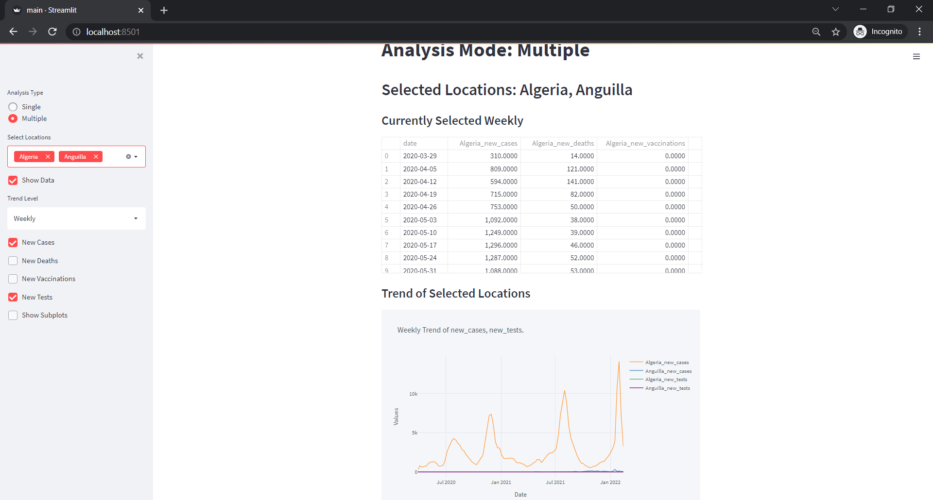
- For multiple, we will first select a few locations using multi select. Then show them in markdown.
if analysis_type=="Multiple":
    selected = sidebar.multiselect("Select Locations ", locations)
    st.markdown(f"## Selected Locations: {', '.join(selected)}")
- Create a checkbox and do the same as above until we create a trends list.
    show_data = sidebar.checkbox("Show Data")
    trend_level = sidebar.selectbox("Trend Level", ["Daily", "Weekly", "Monthly", "Quarterly", "Yearly"])
    st.markdown(f"### Currently Selected {trend_level}")

    trend_kwds = {"Daily": "1D", "Weekly": "1W", "Monthly": "1M", "Quarterly": "1Q", "Yearly": "1Y"}

    trend_data = data.query(f"location in {selected}").\
        groupby(["location", pd.Grouper(key="date",
        freq=trend_kwds[trend_level])]).aggregate(new_cases=("new_cases", "sum"),
        new_deaths = ("new_deaths", "sum"),
        new_vaccinations = ("new_vaccinations", "sum"),
        new_tests = ("new_tests", "sum")).reset_index()

    trend_data["date"] = trend_data.date.dt.date

    new_cases = sidebar.checkbox("New Cases")
    new_deaths = sidebar.checkbox("New Deaths")
    new_vaccinations = sidebar.checkbox("New Vaccinations")
    new_tests = sidebar.checkbox("New Tests")

    lines = [new_cases, new_deaths, new_vaccinations, new_tests]
    line_cols = ["new_cases", "new_deaths", "new_vaccinations", "new_tests"]
    trends = [c[1] for c in zip(lines,line_cols) if c[0]==True]
- Create a new data frame where we will create new columns based on each selected country.
ndf = pd.DataFrame(data=trend_data.date.unique(),columns=["date"])
- For each selected country, create a new column and merge it back to
ndfwith a key as a date.
    for s in selected:
        new_cols = ["date"]+[f"{s}_{c}" for c in line_cols]
        tdf = trend_data.query(f"location=='{s}'")
        tdf.drop("location", axis=1, inplace=True)
        tdf.columns=new_cols
        ndf=ndf.merge(tdf,on="date",how="inner")
- If show_data is selected, we will show the dataframe.
    if show_data:
        if len(ndf)>0:
            st.dataframe(ndf)
        else:
            st.markdown("Empty Dataframe")
- Create a new list where we will put columns related to location.
    new_trends = []
    for c in trends:
        new_trends.extend([f"{s}_{c}" for s in selected])
- Create a subplots checkbox and plot a line plot with
new_trendscolumn names.
    subplots=sidebar.checkbox("Show Subplots", True)
    if len(trends)>0:
        st.markdown("### Trend of Selected Locations")

        fig=ndf.iplot(kind="line", asFigure=True, xTitle="Date", yTitle="Values",
                            x="date", y=new_trends, title=f"{trend_level} Trend of {', '.join(trends)}.", subplots=subplots)
        st.plotly_chart(fig, use_container_width=False)
Full Code
import streamlit as st
import numpy as np
import pandas as pd
import cufflinks

@st.cache
def get_data(url):
    df = pd.read_csv(url)
    df["date"] = pd.to_datetime(df.date).dt.date
    df['date'] = pd.DatetimeIndex(df.date)

    return df

url = "https://covid.ourworldindata.org/data/owid-covid-data.csv"
data = get_data(url)

locations = data.location.unique().tolist()

sidebar = st.sidebar

analysis_type = sidebar.radio("Analysis Type", ["Single", "Multiple"])
st.markdown(f"Analysis Mode: {analysis_type}")

if analysis_type=="Single":
    location_selector = sidebar.selectbox(
        "Select a Location",
        locations
    )
    st.markdown(f"# Currently Selected {location_selector}")
    trend_level = sidebar.selectbox("Trend Level", ["Daily", "Weekly", "Monthly", "Quarterly", "Yearly"])
    st.markdown(f"### Currently Selected {trend_level}")

    show_data = sidebar.checkbox("Show Data")

    trend_kwds = {"Daily": "1D", "Weekly": "1W", "Monthly": "1M", "Quarterly": "1Q", "Yearly": "1Y"}
    trend_data = data.query(f"location=='{location_selector}'").\
        groupby(pd.Grouper(key="date",
        freq=trend_kwds[trend_level])).aggregate(new_cases=("new_cases", "sum"),
        new_deaths = ("new_deaths", "sum"),
        new_vaccinations = ("new_vaccinations", "sum"),
        new_tests = ("new_tests", "sum")).reset_index()

    trend_data["date"] = trend_data.date.dt.date

    new_cases = sidebar.checkbox("New Cases")
    new_deaths = sidebar.checkbox("New Deaths")
    new_vaccinations = sidebar.checkbox("New Vaccinations")
    new_tests = sidebar.checkbox("New Tests")

    lines = [new_cases, new_deaths, new_vaccinations, new_tests]
    line_cols = ["new_cases", "new_deaths", "new_vaccinations", "new_tests"]
    trends = [c[1] for c in zip(lines,line_cols) if c[0]==True]


    if show_data:
        tcols = ["date"] + trends
        st.dataframe(trend_data[tcols])

    subplots=sidebar.checkbox("Show Subplots", True)
    if len(trends)>0:
        fig=trend_data.iplot(kind="line", asFigure=True, xTitle="Date", yTitle="Values",
                            x="date", y=trends, title=f"{trend_level} Trend of {', '.join(trends)}.", subplots=subplots)
        st.plotly_chart(fig, use_container_width=False)

if analysis_type=="Multiple":
    selected = sidebar.multiselect("Select Locations ", locations)
    st.markdown(f"## Selected Locations: {', '.join(selected)}")
    show_data = sidebar.checkbox("Show Data")
    trend_level = sidebar.selectbox("Trend Level", ["Daily", "Weekly", "Monthly", "Quarterly", "Yearly"])
    st.markdown(f"### Currently Selected {trend_level}")

    trend_kwds = {"Daily": "1D", "Weekly": "1W", "Monthly": "1M", "Quarterly": "1Q", "Yearly": "1Y"}

    trend_data = data.query(f"location in {selected}").\
        groupby(["location", pd.Grouper(key="date",
        freq=trend_kwds[trend_level])]).aggregate(new_cases=("new_cases", "sum"),
        new_deaths = ("new_deaths", "sum"),
        new_vaccinations = ("new_vaccinations", "sum"),
        new_tests = ("new_tests", "sum")).reset_index()

    trend_data["date"] = trend_data.date.dt.date

    new_cases = sidebar.checkbox("New Cases")
    new_deaths = sidebar.checkbox("New Deaths")
    new_vaccinations = sidebar.checkbox("New Vaccinations")
    new_tests = sidebar.checkbox("New Tests")

    lines = [new_cases, new_deaths, new_vaccinations, new_tests]
    line_cols = ["new_cases", "new_deaths", "new_vaccinations", "new_tests"]
    trends = [c[1] for c in zip(lines,line_cols) if c[0]==True]

    ndf = pd.DataFrame(data=trend_data.date.unique(),columns=["date"])

    for s in selected:
        new_cols = ["date"]+[f"{s}_{c}" for c in line_cols]
        tdf = trend_data.query(f"location=='{s}'")
        tdf.drop("location", axis=1, inplace=True)
        tdf.columns=new_cols
        ndf=ndf.merge(tdf,on="date",how="inner")

    if show_data:
        if len(ndf)>0:
            st.dataframe(ndf)
        else:
            st.markdown("Empty Dataframe")

    new_trends = []
    for c in trends:
        new_trends.extend([f"{s}_{c}" for s in selected])

    subplots=sidebar.checkbox("Show Subplots", True)
    if len(trends)>0:
        st.markdown("### Trend of Selected Locations")

        fig=ndf.iplot(kind="line", asFigure=True, xTitle="Date", yTitle="Values",
                            x="date", y=new_trends, title=f"{trend_level} Trend of {', '.join(trends)}.", subplots=subplots)
        st.plotly_chart(fig, use_container_width=False)
Output
Single
Multiple


Comments